

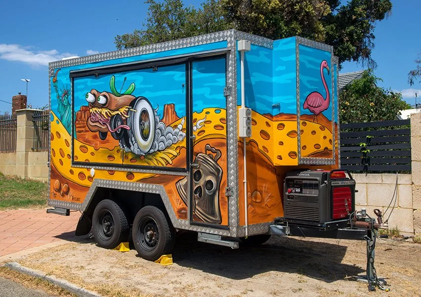
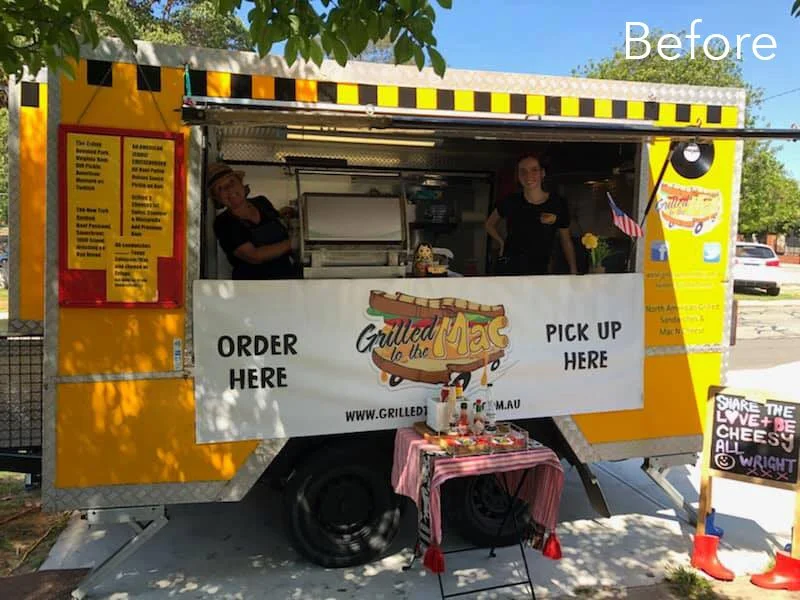
Food Truck Revamp
Kate, the owner of Grilled to the Mac, one of Perth's best-loved food trucks, invited me to collaborate on the redesign of her iconic van. After 10 years in business, Kate knew it was time for a refresh – something bold and eye-catching that would capture the essence of the business and get people talking.
The design was inspired by a dream Kate had. Picture this: a sandwich with wheels, driving down a cheese road through a landscape filled with American icons that reflected the delicious fast food Grilled to the Mac serves.
I immediately gravitated towards the idea of a hot-rod sandwich – something that would make the original logo stand out and align more with the high-energy, fun vibe of the American fast food culture, while still echoing Grilled to the Mac’s ethos: “to the mac (max).” I set to work, pushing the concept further by blending in elements of classic American hot-rod culture and drawing inspiration from the legendary Ed Roth’s artwork.
For the truck’s new design, I chose a striking colour scheme of sky blue and orange to make the artwork bold and dynamic. New, high-impact hot-rod sandwiches and playful icons emerged, making the truck unmistakable on the road.
This total transformation that reflects not just the food but the energy and spirit of the business. Kate was so pleased with the design that she asked me to create a new logo based on the hot-rod sandwich. The new logo better represented the truck’s fresh look and has been a hit with customers.
Since the makeover, Grilled to the Mac has been busier than ever. The positive feedback at events has been overwhelming, and it’s clear that the new look has sparked something special. It’s been a joy to see the truck stand out, drawing in crowds and bringing a little extra flavour to Perth’s already vibrant food scene.


New Shop Fit-Out for Bang Digital
To enhance their presence and create an engaging streetscape, they commissioned me to design and paint a 13-metre-long mural on their front fence. The objective was to not only complement the new space but also to capture attention and spark curiosity among passersby.
Renae, the Managing Director, originally suggested a botanical theme, but I wanted to add an extra dimension—something that would make people stop and take a closer look, especially those waiting at the traffic lights right next to the wall. So, I wove in a playful twist: hidden within the lush botanical elements were “things that go bang!”—unexpected explosive motifs that added a layer of intrigue and fun to the piece.
The mural was a hit. So much so that Bang Digital invited me back to bring the magic indoors with three additional murals to inject even more energy into their workspace. For the final internal mural, I took inspiration from their name and designed a bold, typographic piece spelling out 'BANG'. Each letter was brought to life with elements reflecting the company’s ethos and culture.

When Bang Digital relocated to a new, highly visible corner premises, they saw an opportunity to make a bold statement. To enhance their presence and create an engaging streetscape, they commissioned me to design and paint a 13-metre-long mural on their front fence. The objective was to complement the new space and capture attention and spark curiosity among passersby.
Renae, the Managing Director, originally suggested a botanical theme, but I wanted to add an extra dimension—something that would make people stop and take a closer look, especially those waiting at the traffic lights right next to the wall. So, I wove in a playful twist: hidden within the lush botanical elements were “things that go bang!”—unexpected explosive motifs that added a layer of intrigue and fun to the piece.
The mural was a hit. So much so that Bang Digital invited me back to bring the magic indoors with three additional murals to inject even more energy into their workspace. For the final internal mural, I took inspiration from their name and designed a bold, typographic piece spelling out 'BANG'. Each letter was brought to life with elements reflecting the company’s ethos and culture.
The 'B' featured the iconic Buzzy Bee toy, a nod to Renae’s New Zealand roots and a symbol of fun and imagination. 'A' showcased a retro Superman, representing ownership and taking charge. 'N' incorporated a classic 80s Viewmaster, a reminder to always keep the bigger picture in sight. And 'G' displayed a set of tin cans connected by string—a simple yet powerful representation of communication.
Bringing these murals to life was an absolute joy, and it was fantastic to see Bang Digital embrace creativity as a key part of their brand identity. Their space isn’t just an office—it’s a vibrant, inspiring hub that reflects their dynamic spirit.

"Bang Digital engaged Fieldey to work on our corporate street frontage mural in 2019.
From the moment we first engaged with Fieldey, she really listened to the brief, took the time to ask questions, and got to know our business and the look and feel that we wanted. The street mural is so striking, and its generated a large amount of interest for us and the business, by drawing attention to our building and brand signage.
We then decided to engage Fieldey to complete a body of work inside our office. Again she took on board the challenge of communicating our brand in a highly creative way, as well as working with us, taking feedback on board and refining to get it right.
Fieldey is an absolute delight to work with, and just amazing to watch her in her craft. She is a true talent. I wish I could find some more white space for her to cover."
Renae Lunjevich, Managing Director, Bang Digital


Pop-up Beatles Mural for Kaleidoscope Festival
I recently created a stunning pop-up mural paying tribute to The Beatles, as part of Joondalup’s Kaleidoscope Festival.
Taking inspiration from The Beatles' timeless legacy, I infused the piece with meticulous detail and lifelike representation, capturing the essence of each band member. The artwork served as both a nostalgic homage and a modern interpretation, seamlessly blending street art aesthetics with classic rock iconography.
I wanted to create something that captures the spirit of The Beatles and the energy of the Kaleidoscope Festival—bold, immersive, and full of life.
The pop-up nature of the mural made it a unique attraction, reinforcing the festival’s ethos of ephemeral, ever-changing artistic expression. As the festival wrapped up, the mural disappeared, leaving behind only memories and photographs—a fitting tribute to both the fleeting magic of live art and the timeless legacy of The Beatles.
The Kaleidoscope Festival once again proved itself as a premier event for immersive art experiences, and I was honored that my Beatles mural stood out as a festival highlight.


Custom Window Graphics for Coca-Cola
I had the privilege of again working with Coca-Cola, this time on a unique digital window artwork for Polly Coffee Bar, an iconic venue in the heart of Perth’s main cultural precinct. This was an exciting challenge—creating a design that reflected the cafe owner’s vision while subtly incorporating Coca-Cola branding.
Since the final piece was to be printed onto vinyl and applied to the cafe’s windows, I proposed a photographic-based montage. Inspired by the Colombian coffee region, the artwork was shaped by the owner's desire to emphasise coffee, jungles, and the hardworking growers of Latin America.
To make this vision a reality, I teamed up with professional photographer Matt Fieldes and traveled to Colombia’s Zona Cafetera. There, I personally directed the photography process, capturing the lush landscapes and vibrant coffee culture firsthand.
Using these stunning images, I created a rich jungle and coffee montage—bold, immersive, and alive with color. The Coca-Cola branding was woven in subtly, enhancing rather than overpowering the beauty of the scene. The final window is visually striking tribute to coffee culture that perfectly complements Polly Coffee Bar’s atmosphere.
This project was an incredible journey from concept to completion, and I’m thrilled to see it become part of Perth’s creative landscape.

“We tasked Fieldey with a rather tricky brief. To pay homage to a unique venue, Pollys Coffee Bar, in one of the most iconic part in Perth.
Not only did Fieldey decipher our complex brief, she kept numerous stakeholders happy and engaged while providing a fantastic end solution that complimented the outlet and surrounds.
Fieldey was a delight to work with and I look forward to collaborating with her on many projects to come.”
Kristy Aylmore, Customer Activation Manager, Coca-Cola.

Cult Movie Themed Murals for Winebox Hotel
Another standout project was at Winebox, Chile’s first hotel and winery made entirely from shipping containers. I was invited to create three custom murals in different rooms, blending a wine theme with cult movie references.
Working with my partner Mitch Low, we designed three bespoke murals inspired by Pulp Fiction, Barbarella, and Foxy Brown, each incorporating cheeky wine references. The murals are a blend of black and white realism, with two bright accent colors, carefully matched to each room’s dominant color scheme. Bright retro pop patterns tied everything together, reinforcing the vintage aesthetic while making the murals a seamless part of the interior design.
This visually striking collection of murals enhance the guest experience and serve as a fantastic social media magnet. Visitors frequently share photos of the artwork, turning them into an ongoing promotional tool for the hotel.


Tiki Bar Wall Mural for Streets of Perth
Nikki and Duncan, from Streets of Perth, bought their amazing new home in November last year and asked me to come paint a custom mural to brighten up their outdoor tiki bar. We started stage one last year and on the weekend I came in and finished off stage two by adding Indi the cat and some wood paneling.
The wall originally had a large mosaic on it, but when the house changed hands the old owners took it with them and left a large yellow space to be filled. Nikki and Duncan wanted a trompe l’oeil beach scene with tropical elements to brighten up the space. Inspiration for the beach scene comes from my all time favourite beach, Emily Bay, from Norfolk Island, where I grew up and spent many happy days swimming as a kid.
Our model is the stunning Marina Martini and the cat is the princess of the house, Indi, the rag doll. If they had a pet Macaw it probably wouldn’t last long in a house with cats! Big thank you to Nikki and Duncan for being awesome hosts, Marina for being an awesome model and also to Mitch Low for being no. 1 best minion.

Huge (30M) Mural for Stockland Bull Creek Shopping Centre
I recently had the opportunity to be the chief facilitator and muralist for a project that brought together creativity, community, and local culture. Stockland Bull Creek Shopping Centre commissioned me to create a mural on a massive 30-meter exterior wall, and what made it even more exciting was the involvement of a talented group of Year 11 students from Melville Senior High.
The mural needed to reflect the natural surroundings of the area while using bright colors and an eye-catching narrative. After brainstorming with the students, two inspiring art teachers—Ali Blackwell and Jenna Antoniolli—joined the team, and together we developed a design that reflected the local environment in a meaningful way.
I recently had the opportunity to be the chief facilitator and muralist for a project that brought together creativity, community, and local culture. Stockland Bull Creek Shopping Centre commissioned me to create a mural on a massive 30-meter exterior wall, with the involvement of a talented group of Year 11 students from Melville Senior High.
The mural needed to reflect the natural surroundings of the area while using bright colors and an eye-catching narrative. After brainstorming with the students, two inspiring art teachers—Ali Blackwell and Jenna Antoniolli—joined the team, and together we developed a design that reflected the local environment in a meaningful way.
The theme explored the Nyoongar seasonal calendar, bringing the area’s connection to nature front and centre. The mural features local bird species like the crow, galah, and ibis, painted in vibrant detail. My role was to bring these birds to life, working alongside the students who contributed their skills in patterning and design.
The whole process was a blast. We kicked off with an ideas-building workshop at the school, where I shared techniques and creative concepts with the Year 11 students. Then, over three days, we worked together to transform the blank wall into a work of art. Watching the students take ownership of the project while learning along the way was incredibly rewarding.
This project really showcased how shopping centres like Stockland Bull Creek can not only enrich their environment and connect with the local community through collaborative art.


Mexican-Themed Nightclub Fit-Out
Entertainment Enterprises commissioned me to transform Paramount nightclub in Northbridge, Perth, into a vibrant Mexican-themed party venue: Señor Peppers. The brief was clear—bring the energy of a Dia de los Muertos (Day of the Dead) fiesta to life, with playful and eye-catching artwork that would complement the venue’s new identity.
I spent two weeks painting four massive interior walls during the re-fit construction phase. This was no small feat—large scaffolds became my new best friends as I tackled a particularly tricky 7m x 5m staircase wall, which was transformed into a lively scene of dancing skeletons.
Every brushstroke was carefully considered to align with the interior design and furnishings, ensuring that the murals blended seamlessly into the final aesthetic of the venue. Bold, dynamic colours set the stage for a space that radiated fun, energy, and a true Mexican party vibe.
To capture the spirit of the project, I created a fun ‘making of’ video for Señor Peppers, giving people a behind-the-scenes look at the creative process. This became a fantastic way for the venue to engage with their audience on social media, building excitement before the grand opening.
The end result was a visually striking venue filled with colour, character, and an unmistakable fiesta atmosphere. Seeing my work become an integral part of Señor Peppers was incredibly rewarding, and I couldn’t have been happier to bring this vision to life.
¡Viva la fiesta!

Coca-Cola Space Activation Murals
In November 2015, Coca-Cola tapped renowned Perth street artist Fieldey to bring a touch of retro flair to the legendary Ocean Beach Hotel (OBH) in Cottesloe, Western Australia. The project aimed to bring the vibrant spirit of the beach to life while subtly incorporating Coca-Cola branding.
Fieldey’s first masterpiece adorns the downstairs bar, where she transformed a wall into a stunning depiction of Cottesloe Beach. A custom-painted ‘Gidget’ surfboard was mounted on top, seamlessly tying in with the area’s surf culture. Coca-Cola branding was cleverly integrated, with two retro Coke bottles nestled in the sand and a logo etched onto the surfboard, maintaining a playful yet subtle nod to the brand.

In November 2015, Coca-Cola contacted me, to bring a touch of retro flair to the legendary Ocean Beach Hotel (OBH) in Cottesloe, Western Australia. The project aimed to bring the vibrant spirit of the beach to life while subtly incorporating Coca-Cola branding.
My first mural adorns the downstairs bar, where I transformed a wall into a stunning depiction of Cottesloe Beach. A custom-painted ‘Gidget’ surfboard was mounted on top, tying in with the area’s surf culture, and bringing the art off of the wall and into the space. Coca-Cola branding was subtly integrated, with two retro Coke bottles nestled in the sand and a logo etched onto the surfboard, maintaining a playful yet subtle nod to the brand.
Upstairs at the rooftop bar, I took a different approach with a tiki-inspired mural. The faux wood-paneled design captures the essence of retro beachside bars, complete with a pin-up model sipping a Coke and a glowing neon Coke sign. This vibrant artwork has quickly become a fan favorite, with countless Instagram photos circulating featuring the stunning mural.
The murals have transformed the OBH into a visual spectacle but and become a key part of the bar’s atmosphere. To document the creative process, I produced two custom videos that give a behind-the-scenes look at the project.
These murals are a perfect blend of art, culture, and branding, leaving an unforgettable mark on the iconic Ocean Beach Hotel and further solidifying the relationship between Coca-Cola and artistic expression.

LIQUITEX Skate Art for OZ Comic-Con
In April 2015, Jasco commissioned artist Fieldey to create three unique skate decks for display at Oz Comic-Con in Melbourne, showcasing the versatility of Liquitex products. Fieldey used her signature graffiti-inspired techniques, including basic fades, a liquid soap effect, and chains as stencils, to bring her designs to life.
The three decks featured distinct themes: a Little Red Riding Hood-inspired design, a wild blue and green bulldog, and a tattoo-style board with skulls and chains. Each piece demonstrated how Liquitex aerosol and acrylic paints could work together to create vibrant, textured artworks.
In April 2015, Jasco commissioned me to create three unique skate decks for display at Oz Comic-Con in Melbourne, showcasing the versatility of Liquitex paint products.
I focused on graffiti-inspired techniques, including basic fades, a liquid soap effect, and chains as stencils, to bring my designs to life.
Each skate deck is a storytelling piece - a "Story Boards".
Little Red Riding Hood-Inspired Deck: This design took a playful, dark twist on the classic fairy tale character, with Fieldey’s signature blend of colors and sharp contrasts.
Crazy Blue/Green Bulldog Deck: A wild, energetic design featuring a bulldog in vibrant blues and greens, this deck was a bold representation of Fieldey’s high-energy artistic style.
Skulls and Chains Tattoo-Inspired Deck: With intricate detailing and a moody, monochrome color scheme, this deck captured the essence of tattoo art, showcasing a mastery of both spray paint and acrylic techniques.
A “making of” video, which documents my process from start to finish, was played throughout the event, offering viewers an intimate glimpse of the artistic journey behind the skate decks. The video was later shared across Liquitex Australia’s social media channels, amplifying the success of the collaboration and showcasing my approach to using Liquitex products.
The collaboration brought a burst of color and creativity to an already vibrant Oz Comic-Con, and also highlighted the endless possibilities of Liquitex paints in the hands of a skilled artist. I am always delighted to have oppertunities to work at the intersection of street art and fine craftsmanship.


Seven Skates - Skateboard Range
Perth Street artist, Fieldey, tasked with designing four unique graphics. Fieldey drew inspiration from diverse music genres, including tie-dye, hip-hop, Rasta, and punk culture, to craft an eye-catching collection aimed at a younger audience. The creative process led to the development of striking skull designs, each serving as a bold emblem for its respective genre. Staying true to her signature style, Fieldey meticulously hand-painted each piece before digitizing them for final production. The completed designs were delivered to the client in EPS format, ensuring high-quality, scalable artwork suitable for various applications. This latest project showcases Fieldey’s ability to merge artistic expression with cultural themes, reinforcing her reputation as a leading force in contemporary skateboard art. With its fusion of music, youth culture, and street-style aesthetics, the collection is set to make waves in the skateboard community.

I was given the unique opportunity to showcase my bold, urban inspired painting style, this time with a vibrant new skateboard range that fuses art and music.
Tasked with designing four unique graphics, I drew inspiration from diverse music genres, including tie-dye, hip-hop, Rasta, and punk culture, to craft an eye-catching collection aimed at a younger audience.
Staying true to my signature style, I meticulously hand-painted each piece with striking skull designs, each serving as a bold emblem for its respective genre, before digitising them for final production.
The completed designs were delivered to the client in EPS format, ensuring high-quality, scalable artwork suitable for various applications. This project showcases my ability to merge artistic expression with cultural themes, as I strive to remain a leading force in contemporary street art.


Don't Drink and Drown Campaign
In a creative bid to raise awareness about water safety, a striking custom-painted surfboard became the centerpiece of the "Don't Drink and Drown" campaign, aimed at preventing drownings among 15- to 24-year-olds.
Perth street artist Fieldey was commissioned to design a one-of-a-kind surfboard that would resonate with the campaign’s young audience. The result? A bold, retro-inspired skull submerged in a sea of beer—an eye-catching yet sobering reminder of the dangers of mixing alcohol with water activities.
The visually striking board wasn’t just for display; it was put to action by surfer Moses Le Grice, who rode it at various events throughout 2014. The campaign successfully leveraged surf culture to drive home its serious message in a way that felt fresh, relevant, and engaging for its target demographic
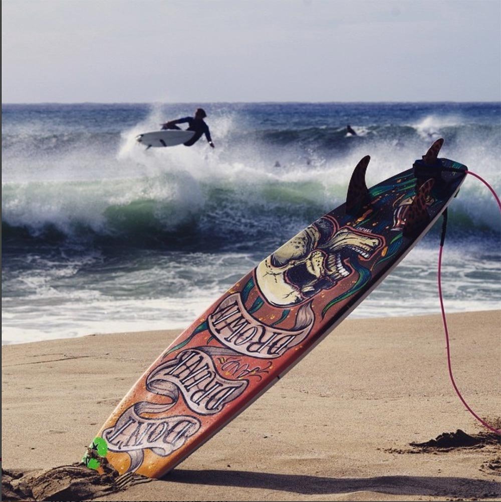
In a creative bid to raise awareness about water safety, I was part of the "Don't Drink and Drown" campaign, which aimed to prevent drownings among 15 to 24-year-olds.
A striking custom-painted surfboard became the campaign's centerpiece. I was commissioned to design a one-of-a-kind surfboard that would resonate with the campaign’s young audience.
My final design was a bold, retro-inspired skull submerged in a sea of beer — an eye-catching yet sobering reminder of the dangers of mixing alcohol with water activities.
The visually striking board was put to action by surfer Moses Le Grice, who rode it at various events throughout 2014. The campaign successfully leveraged surf culture to drive home its serious message in a way that felt fresh, relevant, and engaging for its target demographic.
With its fusion of art, sport, and safety advocacy, the campaign proved that impactful messaging doesn’t have to be boring.

Custom surfboard project for Anytime fitness
When Anytime Fitness needed five custom surfboards as prizes for their 2013 annual conference in Minnesota, they turned to renowned artist Fieldey to bring the vision to life. Fieldey was excited to take on the project but quickly realised that sourcing surfboards in an inland state would be far more difficult than in Australia.
To keep things cost-effective, Fieldey arranged for the boards to be shaped in the U.S., tracking down the only shaper in a neighbouring landlocked state. With the surfboards in production, Fieldey collaborated with Anytime Fitness’ in-house design team to adapt their graphics onto digital surfboard templates.
To ensure a flawless finish, the artwork was printed onto specialised surfboard mesh inlays by an Australian company before being shipped to the U.S. for application during manufacturing. The final result? Five stunning, high-quality surfboards delivered to Minnesota just in time for the conference.
Through creative problem-solving and international collaboration, Fieldey helped Anytime Fitness make waves—without a coastline in sight.
When Anytime Fitness needed five custom surfboards as prizes for their 2013 annual conference in Minnesota, I was thrilled to bring their vision to life. I was excited to take on the project but quickly realized that sourcing surfboards in an inland state would be far more difficult than in Australia.
To keep things cost-effective, I arranged for the boards to be shaped in the U.S., tracking down the only shaper in a neighboring landlocked state. With the surfboards in production, I collaborated with Anytime Fitness' in-house design team to adapt their graphics onto digital surfboard templates.
To ensure a flawless finish, I had the artwork printed onto specialized surfboard mesh inlays by an Australian company before shipping it to the U.S. for application during manufacturing. The final result? Five stunning, high-quality surfboards delivered to Minnesota just in time for the conference.
Through creative problem-solving and international collaboration, I helped Anytime Fitness make waves—without a coastline in sight.


