

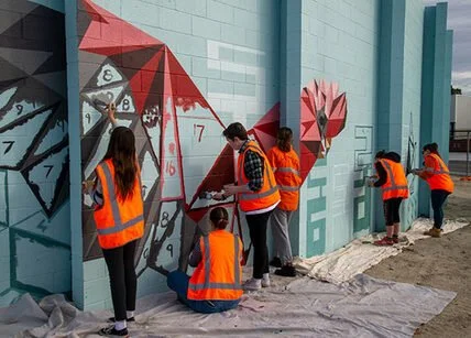
Cowden Park Mural, West Leederville
I recently completed another beautiful piece - an EOI tender to revamp the Cowden Park toilet block, working alongside students from West Leederville Primary School.
For this project, I kicked things off with a concept-building workshop with the students. We explored the theme "Celebrating the beauty of our area," and they came up with incredible ideas that I could incorporate into the mural.
The final design is a fun and vibrant piece that wraps around the building, cleverly integrating areas of the original color to tie it back to its surroundings. A blue horizon line symbolizes Lake Monger, with silhouettes of people enjoying the walking and cycling paths. Native flora and fauna add a local touch, celebrating the area's natural beauty.
To make this project truly community-driven, my team and I created "paint-by-numbers" outlines on the wall. The students then had a painting day, filling in all the flat color areas. They absolutely loved it, and it was amazing to see them proudly point out "their bit" of the mural to friends and family.
I completed the final details, painting realistic birds and animals, and we finished it off with an anti-graffiti coating to ensure longevity.
This project was such a rewarding experience, blending community involvement with creativity.


Manners Hill Park Mural - Peppermint Grove
Securing the tender for Manner’s Hill Park was a testament to the strength of my concept—an elegant and contemporary design that incorporated local flora and fauna in a refined, understated manner.
With this being the Shire of Peppermint Grove’s first mural, my goal was to create an artwork that seamlessly embraced the building while respecting its natural environment. I opted for a modern Australian bush palette, introducing a bold feature colour to provide contrast and visual impact without overwhelming the setting.
To further integrate the mural with its surroundings, I worked with the existing colour of the wall, allowing the artwork to blend harmoniously with the architecture. The design itself is fluid, avoiding hard edges and instead flowing around the building’s sides and the toilet entry walls. This approach not only maximised the space but also ensured the piece felt organic and in tune with its environment.
Bringing this vision to life was a rewarding process, achieved with the support of two assistants over six days of painting. The result is a striking yet sympathetic addition to Peppermint Grove—a mural that enhances rather than imposes, offering a lasting connection between art and nature.


Mural for South Coast Baptist College
I was commissioned by South Coast Baptist College to create a student-assisted mural that would serve as both a visual representation of the school’s identity and a celebration of its sporting culture. The brief required the incorporation of the school’s colours, the animals representing the four sports houses, and a verse that aligned with the school’s values.
To initiate the project, I conducted a concept-building workshop with Year 10 art students. This session allowed the students to actively engage in the creative process, sharing their ideas and perspectives on what the mural should represent. Their input was instrumental in shaping the direction of the design, ensuring that the final artwork would be a true reflection of the school community.
The design I developed incorporated the school colours and featured the four sporting house animals, each carefully integrated into the composition to reflect the unique characteristics of the houses and their respective students. The use of bold, vibrant colours helped to create a dynamic and engaging visual, while the animals were positioned in a way that symbolised both the individuality of each house and their collective unity.
The chosen verse was seamlessly woven into the design, reinforcing the values of the school and adding a layer of meaning to the artwork. This thoughtful inclusion ensured that the mural was not only visually striking but also resonated with the students and staff on a deeper level.
A key aspect of this project was the active involvement of the students in the mural’s execution. Throughout the painting process, the Year 10 students had the opportunity to contribute directly to the artwork, allowing them to take ownership of the mural and deepen their connection to the finished piece. This collaboration resulted in a mural that is not only a testament to the school’s spirit but also a reflection of the students’ creativity and commitment.
The completed mural now stands as a vibrant and meaningful addition to South Coast Baptist College, embodying the school’s values, celebrating its sporting achievements, and showcasing the collaborative effort that went into its creation. It was a privilege to work alongside the students and staff, and the mural will undoubtedly continue to inspire pride and community for years to come.


"Homecoming" - a 40m Long Mural for High Wycombe Train Station
I had the privilege of collaborating with the Public Transport Authority, Right Track, and the City of Kalamunda to create a lasting piece of public art. The location was unique: a 38-meter-long, 2.6-meter-high curved wall on Ibis Place in High Wycombe, near the newly established High Wycombe train station. The wall surrounds an electrical substation and is a prominent feature for pedestrians, cyclists, and drivers accessing the station precinct. The goal was to design an artwork that would not only blend with its surroundings but also resonate with the community that interacts with it daily.
The design process began with a workshop involving a group of young people from the Right Track program. The participants identified key themes that would guide the artwork, including connection, the natural beauty of Kalamunda, and local flora and fauna. The animals that were particularly meaningful to the group—such as Black Cockatoos, Jacarandas, and Kangaroos—became central to the mural’s narrative.
Taking these themes to heart, I developed a design that transitions from the geometric shapes of the city to the organic, natural forms found in the surrounding hills. The left side of the wall features sharp, angular shapes that represent the city, while the right side showcases more realistic depictions of the animals—Black Cockatoos, Kangaroos, and Jacarandas—symbolizing the journey home from work through the familiar landscapes of the hills. The transformation of these geometric city animals into more lifelike forms of wildlife reflects the commuters’ own transition from the urban environment to the serene, natural beauty of their hometowns.
The mural’s unique, curved structure means that it must be walked around to fully experience the artwork, mimicking the unfolding landscape as viewed from a moving train. This design invites viewers to engage with the mural as they move through the space, creating a dynamic experience that is always in motion.

Sam Kerr Mural for Optus Sport
I was given the opportunity to paint a 7-metre-high mural of Matildas superstar Sam Kerr for the Optus Sport documentary Football Belongs. This project was an incredible experience—not only in its scale but also in its message. The mural was completed in just three days, with every step of the process filmed and documented for the feature.
From the outset, my goal was to portray Sam Kerr as more than just an athlete; I wanted to celebrate her strength, power, and determination. Women in street art are so often depicted as passive or ornamental, but with this mural, I aimed to challenge that narrative. I wanted young women and girls to see Sam as an inspiration—someone who has carved out a career at the highest level of football through skill and perseverance.
“So much of street art is pretty girls or pretty girls crying. I wanted to create something that was a bit of an antidote to that,” I explained during the filming of the documentary. Instead of focusing on beauty, this piece captures athleticism and ambition—qualities that define Sam Kerr and set her apart as a role model.
The mural now stands in Fremantle, a striking tribute to one of Australia’s most celebrated athletes. Seeing the response from the community has been incredibly rewarding. Public art has the power to elevate voices, tell stories, and redefine perceptions, and I am honoured to have contributed to this project in a way that highlights the significance of women in sport.
This experience reinforced my belief in the role of street art in shaping conversations and inspiring change. Whether through community projects like the Weeip Park Mural or high-profile commissions like this one, my goal remains the same: to create art that resonates, empowers, and leaves a lasting impact.


Community Mural for Weeip Park Development
As an artist, I believe in the power of art to foster community identity and engagement. The Weeip Park Community Art Mural was a project designed to do just that—creating a vibrant landmark for the Weeip Park Youth Space while involving the young people of Midland to take part as active stakeholders in their own community.
To ensure the mural reflected the voices and experiences of the local youth, I conducted five youth engagement brainstorming sessions and a dedicated workshop. These sessions were designed to gather a diverse range of ideas and stories, ensuring the final artwork was both meaningful and representative of the community. Additionally, drawing on my experience as a YouTube creator, I developed a custom video to promote the project—meeting young people on a platform they use and identify with.
A major theme of the mural is connection—both in the literal sense of Midland’s role as a transport hub and in the way young people come together in shared spaces. The design features colourful squares and shapes that form a semi-realistic map of Midland, highlighting key locations such as schools and Midland Gate. These elements were designed to be accessible for all skill levels, allowing participants to contribute during six community painting days that I facilitated.
Complementing this dynamic map are personal stories and memories, expressed through realistic black-and-white imagery and accompanying text. These contributions, provided by individual young people, create a story trail that visitors can follow throughout the park. The result is a mural that not only enhances the space visually but also serves as a testament to the significance of creative arts in building community and offering young people a sense of belonging and purpose.
This project exemplifies the role of art in shaping public spaces, fostering engagement, and demonstrating to the youth of Midland that creativity is a powerful tool for storytelling, connection, and professional opportunity. I am honoured to have been part of this initiative, and I look forward to seeing the impact it will continue to have on the community.


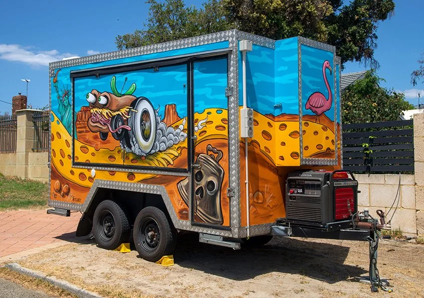
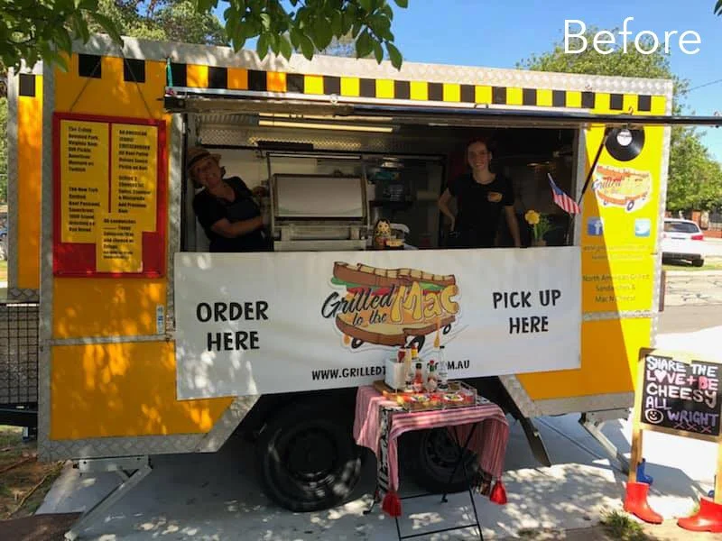
Food Truck Revamp
Kate, the owner of Grilled to the Mac, one of Perth's best-loved food trucks, invited me to collaborate on the redesign of her iconic van. After 10 years in business, Kate knew it was time for a refresh – something bold and eye-catching that would capture the essence of the business and get people talking.
The design was inspired by a dream Kate had. Picture this: a sandwich with wheels, driving down a cheese road through a landscape filled with American icons that reflected the delicious fast food Grilled to the Mac serves.
I immediately gravitated towards the idea of a hot-rod sandwich – something that would make the original logo stand out and align more with the high-energy, fun vibe of the American fast food culture, while still echoing Grilled to the Mac’s ethos: “to the mac (max).” I set to work, pushing the concept further by blending in elements of classic American hot-rod culture and drawing inspiration from the legendary Ed Roth’s artwork.
For the truck’s new design, I chose a striking colour scheme of sky blue and orange to make the artwork bold and dynamic. New, high-impact hot-rod sandwiches and playful icons emerged, making the truck unmistakable on the road.
This total transformation that reflects not just the food but the energy and spirit of the business. Kate was so pleased with the design that she asked me to create a new logo based on the hot-rod sandwich. The new logo better represented the truck’s fresh look and has been a hit with customers.
Since the makeover, Grilled to the Mac has been busier than ever. The positive feedback at events has been overwhelming, and it’s clear that the new look has sparked something special. It’s been a joy to see the truck stand out, drawing in crowds and bringing a little extra flavour to Perth’s already vibrant food scene.


Collaborative Student-Led Murals at Safety Bay Senior High
I was invited to facilitate two student-assisted murals in collaboration with Safety Bay Senior High School. The aim was to beautify the school and engage students in a creative process. The first mural, created for the school’s 40th Anniversary, and the second, promoting ‘The Arts,’ were painted with the help of selected Year 8 to 10 students and art teacher Tracey Sharpe.
The process started with a brainstorming workshop where I guided the students in developing ideas for the mural. Using their input, I created a professional concept that was approved by the school. A second workshop focused on skills development, where I taught painting techniques to help the students gain confidence before the final full-day painting session. The students brought the walls to life, and Tracey and I finished the murals to a professional standard the following day.
Every project I take on is an opportunity to push creative boundaries and bring a little more art into the world. Whether it's a community focused mural or a large scale corporate piece, my goal is always to create something that tells a story and makes an impact.


Pop-up Beatles Mural for Kaleidoscope Festival
I recently created a stunning pop-up mural paying tribute to The Beatles, as part of Joondalup’s Kaleidoscope Festival.
Taking inspiration from The Beatles' timeless legacy, I infused the piece with meticulous detail and lifelike representation, capturing the essence of each band member. The artwork served as both a nostalgic homage and a modern interpretation, seamlessly blending street art aesthetics with classic rock iconography.
I wanted to create something that captures the spirit of The Beatles and the energy of the Kaleidoscope Festival—bold, immersive, and full of life.
The pop-up nature of the mural made it a unique attraction, reinforcing the festival’s ethos of ephemeral, ever-changing artistic expression. As the festival wrapped up, the mural disappeared, leaving behind only memories and photographs—a fitting tribute to both the fleeting magic of live art and the timeless legacy of The Beatles.
The Kaleidoscope Festival once again proved itself as a premier event for immersive art experiences, and I was honored that my Beatles mural stood out as a festival highlight.


Cult Movie Themed Murals for Winebox Hotel
Another standout project was at Winebox, Chile’s first hotel and winery made entirely from shipping containers. I was invited to create three custom murals in different rooms, blending a wine theme with cult movie references.
Working with my partner Mitch Low, we designed three bespoke murals inspired by Pulp Fiction, Barbarella, and Foxy Brown, each incorporating cheeky wine references. The murals are a blend of black and white realism, with two bright accent colors, carefully matched to each room’s dominant color scheme. Bright retro pop patterns tied everything together, reinforcing the vintage aesthetic while making the murals a seamless part of the interior design.
This visually striking collection of murals enhance the guest experience and serve as a fantastic social media magnet. Visitors frequently share photos of the artwork, turning them into an ongoing promotional tool for the hotel.


Tiki Bar Wall Mural for Streets of Perth
Nikki and Duncan, from Streets of Perth, bought their amazing new home in November last year and asked me to come paint a custom mural to brighten up their outdoor tiki bar. We started stage one last year and on the weekend I came in and finished off stage two by adding Indi the cat and some wood paneling.
The wall originally had a large mosaic on it, but when the house changed hands the old owners took it with them and left a large yellow space to be filled. Nikki and Duncan wanted a trompe l’oeil beach scene with tropical elements to brighten up the space. Inspiration for the beach scene comes from my all time favourite beach, Emily Bay, from Norfolk Island, where I grew up and spent many happy days swimming as a kid.
Our model is the stunning Marina Martini and the cat is the princess of the house, Indi, the rag doll. If they had a pet Macaw it probably wouldn’t last long in a house with cats! Big thank you to Nikki and Duncan for being awesome hosts, Marina for being an awesome model and also to Mitch Low for being no. 1 best minion.

Mexican-Themed Nightclub Fit-Out
Entertainment Enterprises commissioned me to transform Paramount nightclub in Northbridge, Perth, into a vibrant Mexican-themed party venue: Señor Peppers. The brief was clear—bring the energy of a Dia de los Muertos (Day of the Dead) fiesta to life, with playful and eye-catching artwork that would complement the venue’s new identity.
I spent two weeks painting four massive interior walls during the re-fit construction phase. This was no small feat—large scaffolds became my new best friends as I tackled a particularly tricky 7m x 5m staircase wall, which was transformed into a lively scene of dancing skeletons.
Every brushstroke was carefully considered to align with the interior design and furnishings, ensuring that the murals blended seamlessly into the final aesthetic of the venue. Bold, dynamic colours set the stage for a space that radiated fun, energy, and a true Mexican party vibe.
To capture the spirit of the project, I created a fun ‘making of’ video for Señor Peppers, giving people a behind-the-scenes look at the creative process. This became a fantastic way for the venue to engage with their audience on social media, building excitement before the grand opening.
The end result was a visually striking venue filled with colour, character, and an unmistakable fiesta atmosphere. Seeing my work become an integral part of Señor Peppers was incredibly rewarding, and I couldn’t have been happier to bring this vision to life.
¡Viva la fiesta!

Amazing New Mural for Santa Fe Restaurant!
“Paint the best wall mural you’ve ever painted…” This was my brief from Andrew and Sue at Santa Fe Restaurant in Subiaco, Perth. After 8 days of painting and pushing myself to the max, I managed to produce the best mural I had painted to date.

“Paint the best wall mural you’ve ever painted…” This was my brief from Andrew and Sue at Santa Fe Restaurant in Subiaco, Perth. After 8 days of painting and pushing myself to the max, I managed to produce the best mural I had painted to date.
Frida Kahlo was a Mexican artist who had a famously tragic life – from having Polio as a child, to being impaled by a tram in an accident when she was 18, which led to multiple spinal operations. She is one of my favourite artists and when Sue and Andrew asked me to paint the inside of iconic Santa Fe restaurant, I jumped at the chance to paint a tribute to Frida and her relationship with her on-and-off-again husband, Diego Rivera whom she affectionately called her “toad-frog”.
Apart from being a famous muralist, Diego was a well known womaniser and their relationship was famously tumultuous; a thrilling story of adultery, bisexuality and general disfunction. They divorced in 1939 and then remarried again the next year.
The structure of the mural is loosely based on one of my favourite paintings of hers, Las Dos Fridas (The Two Fridas) which shows two “Fridas” sitting side by side, with exposed hearts linked together with blood vessels. She painted it shortly after her divorce from Diego in 1939 and it records her emotions surrounding the crisis.
In Santa Fe, Frida is in the main room, with her beloved, ‘toad-frog’, Diego, in the next room. Though they aren’t looking directly at each other, they’re linked by their hearts which are each looking for the other. It’s both a tribute to their own relationship, but also more generally, a comment about the bonds of love and relationships.

Jazz Themed Mural for Four Points by Sheraton
Back in November 2015, Best Brew Bar at Four Points by Sheraton in Perth decided it was time to spice up its vibe. The once-plain walls were in desperate need of some personality, and the team behind the bar wanted to create a space that felt both fresh and professional.
Their idea was simple: combine cool portrait art with intricate patterns to give the bar a lively atmosphere. But there was one catch—the artwork needed to incorporate the bar’s corporate color scheme of grey, red, and green.
Enter artists Fieldey and Rob Jenkins, who totally nailed the brief. Fieldey brought a bold, jazz-inspired portrait to life on the back wall, adding a unique human touch to the bar. Meanwhile, Rob Jenkins worked his magic with stunning leaf patterns that swirled around the space, connecting beautifully with the mural and giving the bar an extra pop.

In November 2015, Best Brew Bar at Four Points by Sheraton Hotel in Perth reached out looking to breathe new life into its once-bare walls. Seeking to create an atmosphere that combined both artistic vibrancy and a professional touch, the venue invited myself and fellow Perth artist Rob Jenkins to create a striking Jazz themed mural.
The bar wanted to fuse my detailed, realistic portrait art with intricate patterning to cover much of the space. Furthermore, they wanted incorporate the venue’s corporate color palette—primarily grey with accents of red and green—into the piece to maintain a sense of continuity and belonging.
Rob and I rose to the occasion, delivering a stunning transformation that leaves a lasting impression. I took center stage with a striking, jazz-themed portrait adorning the rear wall, bringing a human element to the bar's design. Meanwhile, Rob’s signature leaf patterns flowed seamlessly around the bar, interacting with the mural and adding depth and movement to the space.
The final result was a beautiful, large scale mural that draws the eye and adds atmosphere and class to the space. This piece elevates the venue’s aesthetic appeal and ensures that it stands out as a vibrant cultural hub within Perth.

Coca-Cola Space Activation Murals
In November 2015, Coca-Cola tapped renowned Perth street artist Fieldey to bring a touch of retro flair to the legendary Ocean Beach Hotel (OBH) in Cottesloe, Western Australia. The project aimed to bring the vibrant spirit of the beach to life while subtly incorporating Coca-Cola branding.
Fieldey’s first masterpiece adorns the downstairs bar, where she transformed a wall into a stunning depiction of Cottesloe Beach. A custom-painted ‘Gidget’ surfboard was mounted on top, seamlessly tying in with the area’s surf culture. Coca-Cola branding was cleverly integrated, with two retro Coke bottles nestled in the sand and a logo etched onto the surfboard, maintaining a playful yet subtle nod to the brand.

In November 2015, Coca-Cola contacted me, to bring a touch of retro flair to the legendary Ocean Beach Hotel (OBH) in Cottesloe, Western Australia. The project aimed to bring the vibrant spirit of the beach to life while subtly incorporating Coca-Cola branding.
My first mural adorns the downstairs bar, where I transformed a wall into a stunning depiction of Cottesloe Beach. A custom-painted ‘Gidget’ surfboard was mounted on top, tying in with the area’s surf culture, and bringing the art off of the wall and into the space. Coca-Cola branding was subtly integrated, with two retro Coke bottles nestled in the sand and a logo etched onto the surfboard, maintaining a playful yet subtle nod to the brand.
Upstairs at the rooftop bar, I took a different approach with a tiki-inspired mural. The faux wood-paneled design captures the essence of retro beachside bars, complete with a pin-up model sipping a Coke and a glowing neon Coke sign. This vibrant artwork has quickly become a fan favorite, with countless Instagram photos circulating featuring the stunning mural.
The murals have transformed the OBH into a visual spectacle but and become a key part of the bar’s atmosphere. To document the creative process, I produced two custom videos that give a behind-the-scenes look at the project.
These murals are a perfect blend of art, culture, and branding, leaving an unforgettable mark on the iconic Ocean Beach Hotel and further solidifying the relationship between Coca-Cola and artistic expression.