

Manners Hill Park Mural - Peppermint Grove
Securing the tender for Manner’s Hill Park was a testament to the strength of my concept—an elegant and contemporary design that incorporated local flora and fauna in a refined, understated manner.
With this being the Shire of Peppermint Grove’s first mural, my goal was to create an artwork that seamlessly embraced the building while respecting its natural environment. I opted for a modern Australian bush palette, introducing a bold feature colour to provide contrast and visual impact without overwhelming the setting.
To further integrate the mural with its surroundings, I worked with the existing colour of the wall, allowing the artwork to blend harmoniously with the architecture. The design itself is fluid, avoiding hard edges and instead flowing around the building’s sides and the toilet entry walls. This approach not only maximised the space but also ensured the piece felt organic and in tune with its environment.
Bringing this vision to life was a rewarding process, achieved with the support of two assistants over six days of painting. The result is a striking yet sympathetic addition to Peppermint Grove—a mural that enhances rather than imposes, offering a lasting connection between art and nature.


Mural for South Coast Baptist College
I was commissioned by South Coast Baptist College to create a student-assisted mural that would serve as both a visual representation of the school’s identity and a celebration of its sporting culture. The brief required the incorporation of the school’s colours, the animals representing the four sports houses, and a verse that aligned with the school’s values.
To initiate the project, I conducted a concept-building workshop with Year 10 art students. This session allowed the students to actively engage in the creative process, sharing their ideas and perspectives on what the mural should represent. Their input was instrumental in shaping the direction of the design, ensuring that the final artwork would be a true reflection of the school community.
The design I developed incorporated the school colours and featured the four sporting house animals, each carefully integrated into the composition to reflect the unique characteristics of the houses and their respective students. The use of bold, vibrant colours helped to create a dynamic and engaging visual, while the animals were positioned in a way that symbolised both the individuality of each house and their collective unity.
The chosen verse was seamlessly woven into the design, reinforcing the values of the school and adding a layer of meaning to the artwork. This thoughtful inclusion ensured that the mural was not only visually striking but also resonated with the students and staff on a deeper level.
A key aspect of this project was the active involvement of the students in the mural’s execution. Throughout the painting process, the Year 10 students had the opportunity to contribute directly to the artwork, allowing them to take ownership of the mural and deepen their connection to the finished piece. This collaboration resulted in a mural that is not only a testament to the school’s spirit but also a reflection of the students’ creativity and commitment.
The completed mural now stands as a vibrant and meaningful addition to South Coast Baptist College, embodying the school’s values, celebrating its sporting achievements, and showcasing the collaborative effort that went into its creation. It was a privilege to work alongside the students and staff, and the mural will undoubtedly continue to inspire pride and community for years to come.


Food Truck Revamp
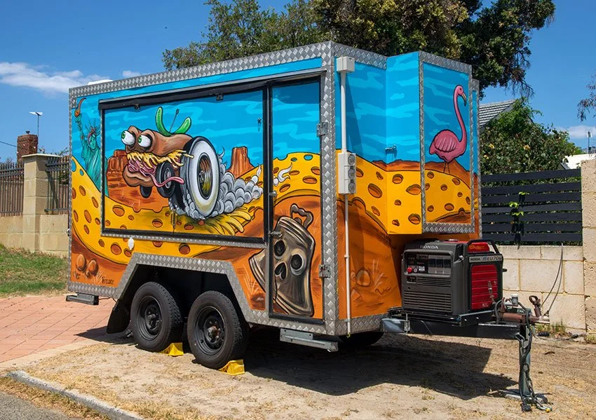
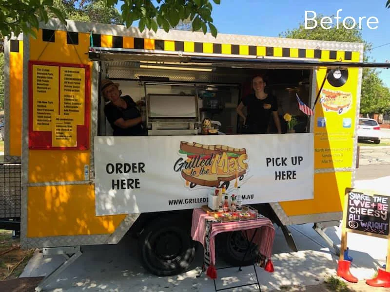
Kate, the owner of Grilled to the Mac, one of Perth's best-loved food trucks, invited me to collaborate on the redesign of her iconic van. After 10 years in business, Kate knew it was time for a refresh – something bold and eye-catching that would capture the essence of the business and get people talking.
The design was inspired by a dream Kate had. Picture this: a sandwich with wheels, driving down a cheese road through a landscape filled with American icons that reflected the delicious fast food Grilled to the Mac serves.
I immediately gravitated towards the idea of a hot-rod sandwich – something that would make the original logo stand out and align more with the high-energy, fun vibe of the American fast food culture, while still echoing Grilled to the Mac’s ethos: “to the mac (max).” I set to work, pushing the concept further by blending in elements of classic American hot-rod culture and drawing inspiration from the legendary Ed Roth’s artwork.
For the truck’s new design, I chose a striking colour scheme of sky blue and orange to make the artwork bold and dynamic. New, high-impact hot-rod sandwiches and playful icons emerged, making the truck unmistakable on the road.
This total transformation that reflects not just the food but the energy and spirit of the business. Kate was so pleased with the design that she asked me to create a new logo based on the hot-rod sandwich. The new logo better represented the truck’s fresh look and has been a hit with customers.
Since the makeover, Grilled to the Mac has been busier than ever. The positive feedback at events has been overwhelming, and it’s clear that the new look has sparked something special. It’s been a joy to see the truck stand out, drawing in crowds and bringing a little extra flavour to Perth’s already vibrant food scene.


New Shop Fit-Out for Bang Digital
To enhance their presence and create an engaging streetscape, they commissioned me to design and paint a 13-metre-long mural on their front fence. The objective was to not only complement the new space but also to capture attention and spark curiosity among passersby.
Renae, the Managing Director, originally suggested a botanical theme, but I wanted to add an extra dimension—something that would make people stop and take a closer look, especially those waiting at the traffic lights right next to the wall. So, I wove in a playful twist: hidden within the lush botanical elements were “things that go bang!”—unexpected explosive motifs that added a layer of intrigue and fun to the piece.
The mural was a hit. So much so that Bang Digital invited me back to bring the magic indoors with three additional murals to inject even more energy into their workspace. For the final internal mural, I took inspiration from their name and designed a bold, typographic piece spelling out 'BANG'. Each letter was brought to life with elements reflecting the company’s ethos and culture.

When Bang Digital relocated to a new, highly visible corner premises, they saw an opportunity to make a bold statement. To enhance their presence and create an engaging streetscape, they commissioned me to design and paint a 13-metre-long mural on their front fence. The objective was to complement the new space and capture attention and spark curiosity among passersby.
Renae, the Managing Director, originally suggested a botanical theme, but I wanted to add an extra dimension—something that would make people stop and take a closer look, especially those waiting at the traffic lights right next to the wall. So, I wove in a playful twist: hidden within the lush botanical elements were “things that go bang!”—unexpected explosive motifs that added a layer of intrigue and fun to the piece.
The mural was a hit. So much so that Bang Digital invited me back to bring the magic indoors with three additional murals to inject even more energy into their workspace. For the final internal mural, I took inspiration from their name and designed a bold, typographic piece spelling out 'BANG'. Each letter was brought to life with elements reflecting the company’s ethos and culture.
The 'B' featured the iconic Buzzy Bee toy, a nod to Renae’s New Zealand roots and a symbol of fun and imagination. 'A' showcased a retro Superman, representing ownership and taking charge. 'N' incorporated a classic 80s Viewmaster, a reminder to always keep the bigger picture in sight. And 'G' displayed a set of tin cans connected by string—a simple yet powerful representation of communication.
Bringing these murals to life was an absolute joy, and it was fantastic to see Bang Digital embrace creativity as a key part of their brand identity. Their space isn’t just an office—it’s a vibrant, inspiring hub that reflects their dynamic spirit.

"Bang Digital engaged Fieldey to work on our corporate street frontage mural in 2019.
From the moment we first engaged with Fieldey, she really listened to the brief, took the time to ask questions, and got to know our business and the look and feel that we wanted. The street mural is so striking, and its generated a large amount of interest for us and the business, by drawing attention to our building and brand signage.
We then decided to engage Fieldey to complete a body of work inside our office. Again she took on board the challenge of communicating our brand in a highly creative way, as well as working with us, taking feedback on board and refining to get it right.
Fieldey is an absolute delight to work with, and just amazing to watch her in her craft. She is a true talent. I wish I could find some more white space for her to cover."
Renae Lunjevich, Managing Director, Bang Digital


Collaborative Student-Led Murals at Safety Bay Senior High
I was invited to facilitate two student-assisted murals in collaboration with Safety Bay Senior High School. The aim was to beautify the school and engage students in a creative process. The first mural, created for the school’s 40th Anniversary, and the second, promoting ‘The Arts,’ were painted with the help of selected Year 8 to 10 students and art teacher Tracey Sharpe.
The process started with a brainstorming workshop where I guided the students in developing ideas for the mural. Using their input, I created a professional concept that was approved by the school. A second workshop focused on skills development, where I taught painting techniques to help the students gain confidence before the final full-day painting session. The students brought the walls to life, and Tracey and I finished the murals to a professional standard the following day.
Every project I take on is an opportunity to push creative boundaries and bring a little more art into the world. Whether it's a community focused mural or a large scale corporate piece, my goal is always to create something that tells a story and makes an impact.


Custom Window Graphics for Coca-Cola
I had the privilege of again working with Coca-Cola, this time on a unique digital window artwork for Polly Coffee Bar, an iconic venue in the heart of Perth’s main cultural precinct. This was an exciting challenge—creating a design that reflected the cafe owner’s vision while subtly incorporating Coca-Cola branding.
Since the final piece was to be printed onto vinyl and applied to the cafe’s windows, I proposed a photographic-based montage. Inspired by the Colombian coffee region, the artwork was shaped by the owner's desire to emphasise coffee, jungles, and the hardworking growers of Latin America.
To make this vision a reality, I teamed up with professional photographer Matt Fieldes and traveled to Colombia’s Zona Cafetera. There, I personally directed the photography process, capturing the lush landscapes and vibrant coffee culture firsthand.
Using these stunning images, I created a rich jungle and coffee montage—bold, immersive, and alive with color. The Coca-Cola branding was woven in subtly, enhancing rather than overpowering the beauty of the scene. The final window is visually striking tribute to coffee culture that perfectly complements Polly Coffee Bar’s atmosphere.
This project was an incredible journey from concept to completion, and I’m thrilled to see it become part of Perth’s creative landscape.

“We tasked Fieldey with a rather tricky brief. To pay homage to a unique venue, Pollys Coffee Bar, in one of the most iconic part in Perth.
Not only did Fieldey decipher our complex brief, she kept numerous stakeholders happy and engaged while providing a fantastic end solution that complimented the outlet and surrounds.
Fieldey was a delight to work with and I look forward to collaborating with her on many projects to come.”
Kristy Aylmore, Customer Activation Manager, Coca-Cola.

Cult Movie Themed Murals for Winebox Hotel
Another standout project was at Winebox, Chile’s first hotel and winery made entirely from shipping containers. I was invited to create three custom murals in different rooms, blending a wine theme with cult movie references.
Working with my partner Mitch Low, we designed three bespoke murals inspired by Pulp Fiction, Barbarella, and Foxy Brown, each incorporating cheeky wine references. The murals are a blend of black and white realism, with two bright accent colors, carefully matched to each room’s dominant color scheme. Bright retro pop patterns tied everything together, reinforcing the vintage aesthetic while making the murals a seamless part of the interior design.
This visually striking collection of murals enhance the guest experience and serve as a fantastic social media magnet. Visitors frequently share photos of the artwork, turning them into an ongoing promotional tool for the hotel.


Mexican-Themed Nightclub Fit-Out
Entertainment Enterprises commissioned me to transform Paramount nightclub in Northbridge, Perth, into a vibrant Mexican-themed party venue: Señor Peppers. The brief was clear—bring the energy of a Dia de los Muertos (Day of the Dead) fiesta to life, with playful and eye-catching artwork that would complement the venue’s new identity.
I spent two weeks painting four massive interior walls during the re-fit construction phase. This was no small feat—large scaffolds became my new best friends as I tackled a particularly tricky 7m x 5m staircase wall, which was transformed into a lively scene of dancing skeletons.
Every brushstroke was carefully considered to align with the interior design and furnishings, ensuring that the murals blended seamlessly into the final aesthetic of the venue. Bold, dynamic colours set the stage for a space that radiated fun, energy, and a true Mexican party vibe.
To capture the spirit of the project, I created a fun ‘making of’ video for Señor Peppers, giving people a behind-the-scenes look at the creative process. This became a fantastic way for the venue to engage with their audience on social media, building excitement before the grand opening.
The end result was a visually striking venue filled with colour, character, and an unmistakable fiesta atmosphere. Seeing my work become an integral part of Señor Peppers was incredibly rewarding, and I couldn’t have been happier to bring this vision to life.
¡Viva la fiesta!

Amazing New Mural for Santa Fe Restaurant!
“Paint the best wall mural you’ve ever painted…” This was my brief from Andrew and Sue at Santa Fe Restaurant in Subiaco, Perth. After 8 days of painting and pushing myself to the max, I managed to produce the best mural I had painted to date.

“Paint the best wall mural you’ve ever painted…” This was my brief from Andrew and Sue at Santa Fe Restaurant in Subiaco, Perth. After 8 days of painting and pushing myself to the max, I managed to produce the best mural I had painted to date.
Frida Kahlo was a Mexican artist who had a famously tragic life – from having Polio as a child, to being impaled by a tram in an accident when she was 18, which led to multiple spinal operations. She is one of my favourite artists and when Sue and Andrew asked me to paint the inside of iconic Santa Fe restaurant, I jumped at the chance to paint a tribute to Frida and her relationship with her on-and-off-again husband, Diego Rivera whom she affectionately called her “toad-frog”.
Apart from being a famous muralist, Diego was a well known womaniser and their relationship was famously tumultuous; a thrilling story of adultery, bisexuality and general disfunction. They divorced in 1939 and then remarried again the next year.
The structure of the mural is loosely based on one of my favourite paintings of hers, Las Dos Fridas (The Two Fridas) which shows two “Fridas” sitting side by side, with exposed hearts linked together with blood vessels. She painted it shortly after her divorce from Diego in 1939 and it records her emotions surrounding the crisis.
In Santa Fe, Frida is in the main room, with her beloved, ‘toad-frog’, Diego, in the next room. Though they aren’t looking directly at each other, they’re linked by their hearts which are each looking for the other. It’s both a tribute to their own relationship, but also more generally, a comment about the bonds of love and relationships.

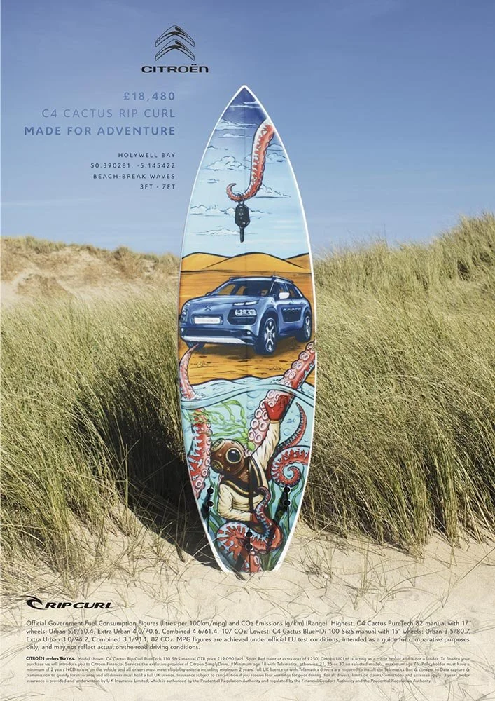
Surfboard Graphic to Promote CITROËN Europe & Ripcurl's NEW CACTUS C4
Back in March 2016, I had the incredible opportunity to be part of a unique project with Havas Work Club in London. The campaign aimed to launch the new RipCurl edition Citroën C4 Cactus, and they wanted to combine surf culture with automotive style in a way that hadn't been done before. To bring this vision to life, they called on three of the world’s best surf artists—one of which was me, representing Australia.
We were challenged with creating custom surfboard graphics that would not only fit the vibe of Citroën’s rugged yet stylish vehicle but also align with RipCurl's spirit of adventure. To make it even more exciting, we were asked to film the entire process on GoPro cameras to give fans a behind-the-scenes look at how we created the art. The idea was to make the campaign feel as authentic as the boards we were painting.
In March 2016, I had the incredible opportunity to be part of a unique project with Havas Work Club in London. The campaign aimed to launch the new RipCurl edition Citroën C4 Cactus, and they wanted to combine surf culture with automotive style in a way that hadn't been done before. To bring this vision to life, they called on three of the world’s best surf artists—one of which was me, representing Australia.
We were challenged with create custom surfboards that would fit the vibe of Citroën’s rugged yet stylish vehicle and align with RipCurl's spirit of adventure. To make it even more exciting, we were asked to film the entire process on GoPro cameras to give fans a behind-the-scenes look at how we created the art. The idea was to make the campaign feel as authentic as the boards we were painting.
For my part, I hand-painted an artwork that was inspired by the natural textures of surfboards and the energy of the ocean. After completing the piece, I carefully photographed it, digitised the image to meet the agency’s specifications, and sent it off to Havas in London. They printed the artwork onto a mesh inlay, which was then glassed into specially handcrafted surfboards.
The real magic happened when those boards were photographed in their natural element—alongside the Citroën C4 Cactus. The final result was stunning: a fusion of art, sport, and the open road that was showcased in print and online across Europe. The campaign a huge success and the boards were later auctioned off for charity, giving back to The Wave Project; a group based in Cornwall, that help young adults to gain confidence and reduce anxiety through surfing,
The "making of" videos we filmed became a powerful tool in promoting the campaign, giving viewers a glimpse of the creative process and the passion behind each board. It was an amazing experience to be a part of such a global project that brought together the worlds of surfing, automotive design, and art.
Click to read more about the campaign and see the boards in action!


Iron Fist Clothing Merchandise
I had the privilege of partnering with Iron Fist Clothing between 2013 and 2015 to create hand-painted artwork for their clothing ranges. This collaboration involved designing artwork that embodied the brand’s edgy, bold aesthetic while being adaptable across a diverse array of merchandise.
The challenge was to create artwork with a hand-painted feel while delivering high-resolution digital files, ensuring the designs could be reproduced across various items, from shoes and bags to clothing and bikinis. The brief was clear: the designs needed to be vibrant, fun, and youthful, perfectly aligning with Iron Fist’s alternative, femme-focused customer base.

I had the privilege of partnering with Iron Fist Clothing between 2013 and 2015 to create hand-painted artwork for their clothing ranges. This collaboration involved designing artwork that embodied the brand’s edgy, bold aesthetic while being adaptable across a diverse array of merchandise.
The challenge was to create artwork with a hand-painted feel while delivering high-resolution digital files, ensuring the designs could be reproduced across various items, from shoes and bags to clothing and bikinis. The designs needed to be vibrant, fun, and youthful - perfectly aligning with Iron Fist’s alternative, femme-focused customer base.
Over the course of the three years, I produced six unique pieces of artwork. These designs were applied to a wide range of apparel, helping to define the brand's distinct identity and appeal to a broad audience. It was incredibly rewarding to see my art featured across so many different products, knowing it resonated with Iron Fist’s customers around the world.


LIQUITEX Skate Art for OZ Comic-Con
In April 2015, Jasco commissioned artist Fieldey to create three unique skate decks for display at Oz Comic-Con in Melbourne, showcasing the versatility of Liquitex products. Fieldey used her signature graffiti-inspired techniques, including basic fades, a liquid soap effect, and chains as stencils, to bring her designs to life.
The three decks featured distinct themes: a Little Red Riding Hood-inspired design, a wild blue and green bulldog, and a tattoo-style board with skulls and chains. Each piece demonstrated how Liquitex aerosol and acrylic paints could work together to create vibrant, textured artworks.
In April 2015, Jasco commissioned me to create three unique skate decks for display at Oz Comic-Con in Melbourne, showcasing the versatility of Liquitex paint products.
I focused on graffiti-inspired techniques, including basic fades, a liquid soap effect, and chains as stencils, to bring my designs to life.
Each skate deck is a storytelling piece - a "Story Boards".
Little Red Riding Hood-Inspired Deck: This design took a playful, dark twist on the classic fairy tale character, with Fieldey’s signature blend of colors and sharp contrasts.
Crazy Blue/Green Bulldog Deck: A wild, energetic design featuring a bulldog in vibrant blues and greens, this deck was a bold representation of Fieldey’s high-energy artistic style.
Skulls and Chains Tattoo-Inspired Deck: With intricate detailing and a moody, monochrome color scheme, this deck captured the essence of tattoo art, showcasing a mastery of both spray paint and acrylic techniques.
A “making of” video, which documents my process from start to finish, was played throughout the event, offering viewers an intimate glimpse of the artistic journey behind the skate decks. The video was later shared across Liquitex Australia’s social media channels, amplifying the success of the collaboration and showcasing my approach to using Liquitex products.
The collaboration brought a burst of color and creativity to an already vibrant Oz Comic-Con, and also highlighted the endless possibilities of Liquitex paints in the hands of a skilled artist. I am always delighted to have oppertunities to work at the intersection of street art and fine craftsmanship.


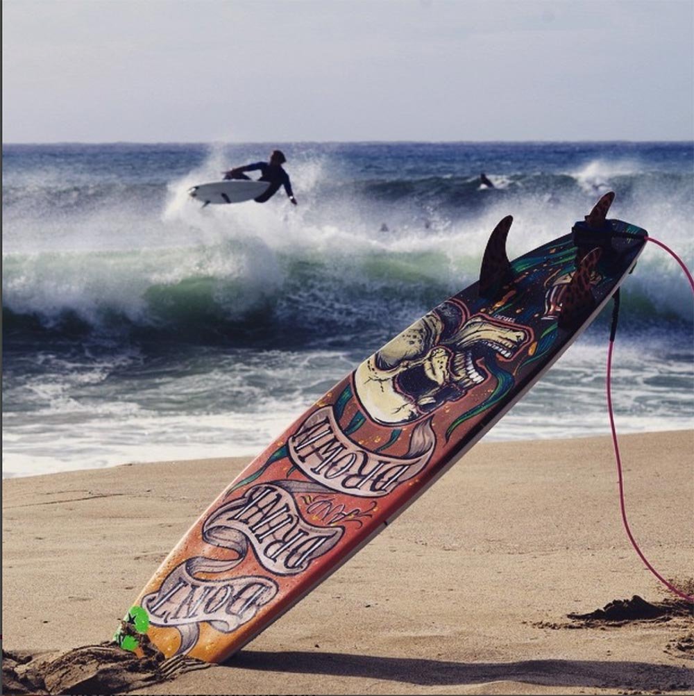
Don't Drink and Drown Campaign
In a creative bid to raise awareness about water safety, a striking custom-painted surfboard became the centerpiece of the "Don't Drink and Drown" campaign, aimed at preventing drownings among 15- to 24-year-olds.
Perth street artist Fieldey was commissioned to design a one-of-a-kind surfboard that would resonate with the campaign’s young audience. The result? A bold, retro-inspired skull submerged in a sea of beer—an eye-catching yet sobering reminder of the dangers of mixing alcohol with water activities.
The visually striking board wasn’t just for display; it was put to action by surfer Moses Le Grice, who rode it at various events throughout 2014. The campaign successfully leveraged surf culture to drive home its serious message in a way that felt fresh, relevant, and engaging for its target demographic
In a creative bid to raise awareness about water safety, I was part of the "Don't Drink and Drown" campaign, which aimed to prevent drownings among 15 to 24-year-olds.
A striking custom-painted surfboard became the campaign's centerpiece. I was commissioned to design a one-of-a-kind surfboard that would resonate with the campaign’s young audience.
My final design was a bold, retro-inspired skull submerged in a sea of beer — an eye-catching yet sobering reminder of the dangers of mixing alcohol with water activities.
The visually striking board was put to action by surfer Moses Le Grice, who rode it at various events throughout 2014. The campaign successfully leveraged surf culture to drive home its serious message in a way that felt fresh, relevant, and engaging for its target demographic.
With its fusion of art, sport, and safety advocacy, the campaign proved that impactful messaging doesn’t have to be boring.