

Cowden Park Mural, West Leederville
I recently completed another beautiful piece - an EOI tender to revamp the Cowden Park toilet block, working alongside students from West Leederville Primary School.
For this project, I kicked things off with a concept-building workshop with the students. We explored the theme "Celebrating the beauty of our area," and they came up with incredible ideas that I could incorporate into the mural.
The final design is a fun and vibrant piece that wraps around the building, cleverly integrating areas of the original color to tie it back to its surroundings. A blue horizon line symbolizes Lake Monger, with silhouettes of people enjoying the walking and cycling paths. Native flora and fauna add a local touch, celebrating the area's natural beauty.
To make this project truly community-driven, my team and I created "paint-by-numbers" outlines on the wall. The students then had a painting day, filling in all the flat color areas. They absolutely loved it, and it was amazing to see them proudly point out "their bit" of the mural to friends and family.
I completed the final details, painting realistic birds and animals, and we finished it off with an anti-graffiti coating to ensure longevity.
This project was such a rewarding experience, blending community involvement with creativity.


Manners Hill Park Mural - Peppermint Grove
Securing the tender for Manner’s Hill Park was a testament to the strength of my concept—an elegant and contemporary design that incorporated local flora and fauna in a refined, understated manner.
With this being the Shire of Peppermint Grove’s first mural, my goal was to create an artwork that seamlessly embraced the building while respecting its natural environment. I opted for a modern Australian bush palette, introducing a bold feature colour to provide contrast and visual impact without overwhelming the setting.
To further integrate the mural with its surroundings, I worked with the existing colour of the wall, allowing the artwork to blend harmoniously with the architecture. The design itself is fluid, avoiding hard edges and instead flowing around the building’s sides and the toilet entry walls. This approach not only maximised the space but also ensured the piece felt organic and in tune with its environment.
Bringing this vision to life was a rewarding process, achieved with the support of two assistants over six days of painting. The result is a striking yet sympathetic addition to Peppermint Grove—a mural that enhances rather than imposes, offering a lasting connection between art and nature.


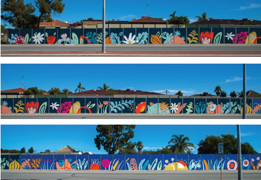
250m-Long Mural for Spearwood Ave, Yangebup
I was awarded a commission through an Expression of Interest (EOI) process to transform a 250-meter-long noise wall on Spearwood Avenue. The wall, which had originally been painted in a drab green colour, had long been an eyesore for the local residents. Positioned along a busy road where cars travel at speeds of up to 70 km/h, the wall had limited visibility to pedestrians, and the challenge was to create an engaging design that would be seen predominantly from passing vehicles.
The brief called for a simple, bright, and fun design that would uplift the area while also reflecting the unique characteristics of the suburb. To guide the design process, I held a community consultation workshop, where local residents shared their thoughts on what made Spearwood special. The feedback was invaluable, with many participants pointing out that the wall’s primary audience would be drivers rather than pedestrians, which meant that intricate details would not be visible. As a result, the design needed to focus on large, semi-abstract shapes that would be effective from a distance.
The mural itself is divided into three sections, each representing a different aspect of the suburb’s ecosystems. The leftmost section depicts the inland market gardens, which are a prominent feature of the area. This part of the mural features stylised representations of flowers and onions, reflecting the agricultural history of Spearwood. The middle section transitions into the wetlands, with abstract shapes representing plants such as banksia, bulrushes, gum trees, and tuart flowers. Finally, the mural moves into the coastal zone, showcasing flora such as pigface, Geraldton wax flowers, dune mosses, cushion bush, and seaweed—plants that are native to the region and reflect the suburb’s connection to the sea.
This thoughtful progression from inland market gardens to wetlands and then to the coast creates a visual narrative that mirrors the natural environment surrounding Spearwood. The design's bold and vibrant colours, combined with its large-scale semi-abstract shapes, ensure that the mural stands out from the passing traffic and provides a visual experience for drivers.
The project was completed over the course of nine days, with myself and a team of skilled assistants working to bring the design to life. The outcome is a mural that not only brightens the once-drab wall but also celebrates the local flora and fauna, giving the residents of Spearwood a meaningful and colourful representation of their community's unique ecosystems.
This project highlights the power of public art in transforming urban spaces and fostering a sense of pride and connection within the community. It was a rewarding experience to work closely with the residents and contribute to the aesthetic improvement of Spearwood Avenue.


Mural for South Coast Baptist College
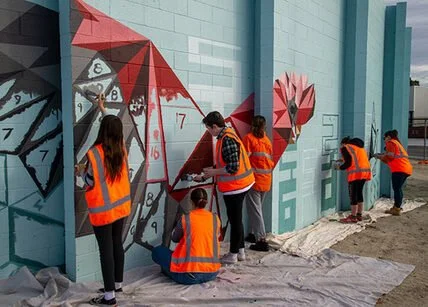
I was commissioned by South Coast Baptist College to create a student-assisted mural that would serve as both a visual representation of the school’s identity and a celebration of its sporting culture. The brief required the incorporation of the school’s colours, the animals representing the four sports houses, and a verse that aligned with the school’s values.
To initiate the project, I conducted a concept-building workshop with Year 10 art students. This session allowed the students to actively engage in the creative process, sharing their ideas and perspectives on what the mural should represent. Their input was instrumental in shaping the direction of the design, ensuring that the final artwork would be a true reflection of the school community.
The design I developed incorporated the school colours and featured the four sporting house animals, each carefully integrated into the composition to reflect the unique characteristics of the houses and their respective students. The use of bold, vibrant colours helped to create a dynamic and engaging visual, while the animals were positioned in a way that symbolised both the individuality of each house and their collective unity.
The chosen verse was seamlessly woven into the design, reinforcing the values of the school and adding a layer of meaning to the artwork. This thoughtful inclusion ensured that the mural was not only visually striking but also resonated with the students and staff on a deeper level.
A key aspect of this project was the active involvement of the students in the mural’s execution. Throughout the painting process, the Year 10 students had the opportunity to contribute directly to the artwork, allowing them to take ownership of the mural and deepen their connection to the finished piece. This collaboration resulted in a mural that is not only a testament to the school’s spirit but also a reflection of the students’ creativity and commitment.
The completed mural now stands as a vibrant and meaningful addition to South Coast Baptist College, embodying the school’s values, celebrating its sporting achievements, and showcasing the collaborative effort that went into its creation. It was a privilege to work alongside the students and staff, and the mural will undoubtedly continue to inspire pride and community for years to come.


"Homecoming" - a 40m Long Mural for High Wycombe Train Station
I had the privilege of collaborating with the Public Transport Authority, Right Track, and the City of Kalamunda to create a lasting piece of public art. The location was unique: a 38-meter-long, 2.6-meter-high curved wall on Ibis Place in High Wycombe, near the newly established High Wycombe train station. The wall surrounds an electrical substation and is a prominent feature for pedestrians, cyclists, and drivers accessing the station precinct. The goal was to design an artwork that would not only blend with its surroundings but also resonate with the community that interacts with it daily.
The design process began with a workshop involving a group of young people from the Right Track program. The participants identified key themes that would guide the artwork, including connection, the natural beauty of Kalamunda, and local flora and fauna. The animals that were particularly meaningful to the group—such as Black Cockatoos, Jacarandas, and Kangaroos—became central to the mural’s narrative.
Taking these themes to heart, I developed a design that transitions from the geometric shapes of the city to the organic, natural forms found in the surrounding hills. The left side of the wall features sharp, angular shapes that represent the city, while the right side showcases more realistic depictions of the animals—Black Cockatoos, Kangaroos, and Jacarandas—symbolizing the journey home from work through the familiar landscapes of the hills. The transformation of these geometric city animals into more lifelike forms of wildlife reflects the commuters’ own transition from the urban environment to the serene, natural beauty of their hometowns.
The mural’s unique, curved structure means that it must be walked around to fully experience the artwork, mimicking the unfolding landscape as viewed from a moving train. This design invites viewers to engage with the mural as they move through the space, creating a dynamic experience that is always in motion.

Food Truck Revamp
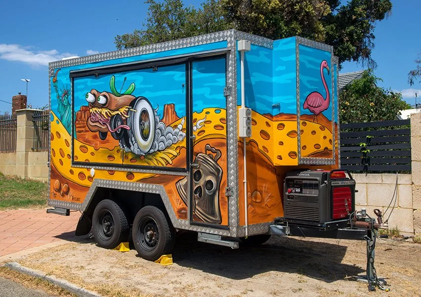
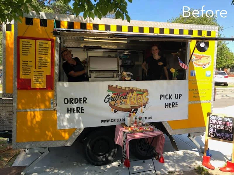
Kate, the owner of Grilled to the Mac, one of Perth's best-loved food trucks, invited me to collaborate on the redesign of her iconic van. After 10 years in business, Kate knew it was time for a refresh – something bold and eye-catching that would capture the essence of the business and get people talking.
The design was inspired by a dream Kate had. Picture this: a sandwich with wheels, driving down a cheese road through a landscape filled with American icons that reflected the delicious fast food Grilled to the Mac serves.
I immediately gravitated towards the idea of a hot-rod sandwich – something that would make the original logo stand out and align more with the high-energy, fun vibe of the American fast food culture, while still echoing Grilled to the Mac’s ethos: “to the mac (max).” I set to work, pushing the concept further by blending in elements of classic American hot-rod culture and drawing inspiration from the legendary Ed Roth’s artwork.
For the truck’s new design, I chose a striking colour scheme of sky blue and orange to make the artwork bold and dynamic. New, high-impact hot-rod sandwiches and playful icons emerged, making the truck unmistakable on the road.
This total transformation that reflects not just the food but the energy and spirit of the business. Kate was so pleased with the design that she asked me to create a new logo based on the hot-rod sandwich. The new logo better represented the truck’s fresh look and has been a hit with customers.
Since the makeover, Grilled to the Mac has been busier than ever. The positive feedback at events has been overwhelming, and it’s clear that the new look has sparked something special. It’s been a joy to see the truck stand out, drawing in crowds and bringing a little extra flavour to Perth’s already vibrant food scene.


Mexican-Themed Nightclub Fit-Out
Entertainment Enterprises commissioned me to transform Paramount nightclub in Northbridge, Perth, into a vibrant Mexican-themed party venue: Señor Peppers. The brief was clear—bring the energy of a Dia de los Muertos (Day of the Dead) fiesta to life, with playful and eye-catching artwork that would complement the venue’s new identity.
I spent two weeks painting four massive interior walls during the re-fit construction phase. This was no small feat—large scaffolds became my new best friends as I tackled a particularly tricky 7m x 5m staircase wall, which was transformed into a lively scene of dancing skeletons.
Every brushstroke was carefully considered to align with the interior design and furnishings, ensuring that the murals blended seamlessly into the final aesthetic of the venue. Bold, dynamic colours set the stage for a space that radiated fun, energy, and a true Mexican party vibe.
To capture the spirit of the project, I created a fun ‘making of’ video for Señor Peppers, giving people a behind-the-scenes look at the creative process. This became a fantastic way for the venue to engage with their audience on social media, building excitement before the grand opening.
The end result was a visually striking venue filled with colour, character, and an unmistakable fiesta atmosphere. Seeing my work become an integral part of Señor Peppers was incredibly rewarding, and I couldn’t have been happier to bring this vision to life.
¡Viva la fiesta!

Iron Fist Clothing Merchandise
I had the privilege of partnering with Iron Fist Clothing between 2013 and 2015 to create hand-painted artwork for their clothing ranges. This collaboration involved designing artwork that embodied the brand’s edgy, bold aesthetic while being adaptable across a diverse array of merchandise.
The challenge was to create artwork with a hand-painted feel while delivering high-resolution digital files, ensuring the designs could be reproduced across various items, from shoes and bags to clothing and bikinis. The brief was clear: the designs needed to be vibrant, fun, and youthful, perfectly aligning with Iron Fist’s alternative, femme-focused customer base.

I had the privilege of partnering with Iron Fist Clothing between 2013 and 2015 to create hand-painted artwork for their clothing ranges. This collaboration involved designing artwork that embodied the brand’s edgy, bold aesthetic while being adaptable across a diverse array of merchandise.
The challenge was to create artwork with a hand-painted feel while delivering high-resolution digital files, ensuring the designs could be reproduced across various items, from shoes and bags to clothing and bikinis. The designs needed to be vibrant, fun, and youthful - perfectly aligning with Iron Fist’s alternative, femme-focused customer base.
Over the course of the three years, I produced six unique pieces of artwork. These designs were applied to a wide range of apparel, helping to define the brand's distinct identity and appeal to a broad audience. It was incredibly rewarding to see my art featured across so many different products, knowing it resonated with Iron Fist’s customers around the world.


Jazz Themed Mural for Four Points by Sheraton
Back in November 2015, Best Brew Bar at Four Points by Sheraton in Perth decided it was time to spice up its vibe. The once-plain walls were in desperate need of some personality, and the team behind the bar wanted to create a space that felt both fresh and professional.
Their idea was simple: combine cool portrait art with intricate patterns to give the bar a lively atmosphere. But there was one catch—the artwork needed to incorporate the bar’s corporate color scheme of grey, red, and green.
Enter artists Fieldey and Rob Jenkins, who totally nailed the brief. Fieldey brought a bold, jazz-inspired portrait to life on the back wall, adding a unique human touch to the bar. Meanwhile, Rob Jenkins worked his magic with stunning leaf patterns that swirled around the space, connecting beautifully with the mural and giving the bar an extra pop.

In November 2015, Best Brew Bar at Four Points by Sheraton Hotel in Perth reached out looking to breathe new life into its once-bare walls. Seeking to create an atmosphere that combined both artistic vibrancy and a professional touch, the venue invited myself and fellow Perth artist Rob Jenkins to create a striking Jazz themed mural.
The bar wanted to fuse my detailed, realistic portrait art with intricate patterning to cover much of the space. Furthermore, they wanted incorporate the venue’s corporate color palette—primarily grey with accents of red and green—into the piece to maintain a sense of continuity and belonging.
Rob and I rose to the occasion, delivering a stunning transformation that leaves a lasting impression. I took center stage with a striking, jazz-themed portrait adorning the rear wall, bringing a human element to the bar's design. Meanwhile, Rob’s signature leaf patterns flowed seamlessly around the bar, interacting with the mural and adding depth and movement to the space.
The final result was a beautiful, large scale mural that draws the eye and adds atmosphere and class to the space. This piece elevates the venue’s aesthetic appeal and ensures that it stands out as a vibrant cultural hub within Perth.

LIQUITEX Skate Art for OZ Comic-Con
In April 2015, Jasco commissioned artist Fieldey to create three unique skate decks for display at Oz Comic-Con in Melbourne, showcasing the versatility of Liquitex products. Fieldey used her signature graffiti-inspired techniques, including basic fades, a liquid soap effect, and chains as stencils, to bring her designs to life.
The three decks featured distinct themes: a Little Red Riding Hood-inspired design, a wild blue and green bulldog, and a tattoo-style board with skulls and chains. Each piece demonstrated how Liquitex aerosol and acrylic paints could work together to create vibrant, textured artworks.
In April 2015, Jasco commissioned me to create three unique skate decks for display at Oz Comic-Con in Melbourne, showcasing the versatility of Liquitex paint products.
I focused on graffiti-inspired techniques, including basic fades, a liquid soap effect, and chains as stencils, to bring my designs to life.
Each skate deck is a storytelling piece - a "Story Boards".
Little Red Riding Hood-Inspired Deck: This design took a playful, dark twist on the classic fairy tale character, with Fieldey’s signature blend of colors and sharp contrasts.
Crazy Blue/Green Bulldog Deck: A wild, energetic design featuring a bulldog in vibrant blues and greens, this deck was a bold representation of Fieldey’s high-energy artistic style.
Skulls and Chains Tattoo-Inspired Deck: With intricate detailing and a moody, monochrome color scheme, this deck captured the essence of tattoo art, showcasing a mastery of both spray paint and acrylic techniques.
A “making of” video, which documents my process from start to finish, was played throughout the event, offering viewers an intimate glimpse of the artistic journey behind the skate decks. The video was later shared across Liquitex Australia’s social media channels, amplifying the success of the collaboration and showcasing my approach to using Liquitex products.
The collaboration brought a burst of color and creativity to an already vibrant Oz Comic-Con, and also highlighted the endless possibilities of Liquitex paints in the hands of a skilled artist. I am always delighted to have oppertunities to work at the intersection of street art and fine craftsmanship.


