

Cowden Park Mural, West Leederville
I recently completed another beautiful piece - an EOI tender to revamp the Cowden Park toilet block, working alongside students from West Leederville Primary School.
For this project, I kicked things off with a concept-building workshop with the students. We explored the theme "Celebrating the beauty of our area," and they came up with incredible ideas that I could incorporate into the mural.
The final design is a fun and vibrant piece that wraps around the building, cleverly integrating areas of the original color to tie it back to its surroundings. A blue horizon line symbolizes Lake Monger, with silhouettes of people enjoying the walking and cycling paths. Native flora and fauna add a local touch, celebrating the area's natural beauty.
To make this project truly community-driven, my team and I created "paint-by-numbers" outlines on the wall. The students then had a painting day, filling in all the flat color areas. They absolutely loved it, and it was amazing to see them proudly point out "their bit" of the mural to friends and family.
I completed the final details, painting realistic birds and animals, and we finished it off with an anti-graffiti coating to ensure longevity.
This project was such a rewarding experience, blending community involvement with creativity.


250m-Long Mural for Spearwood Ave, Yangebup
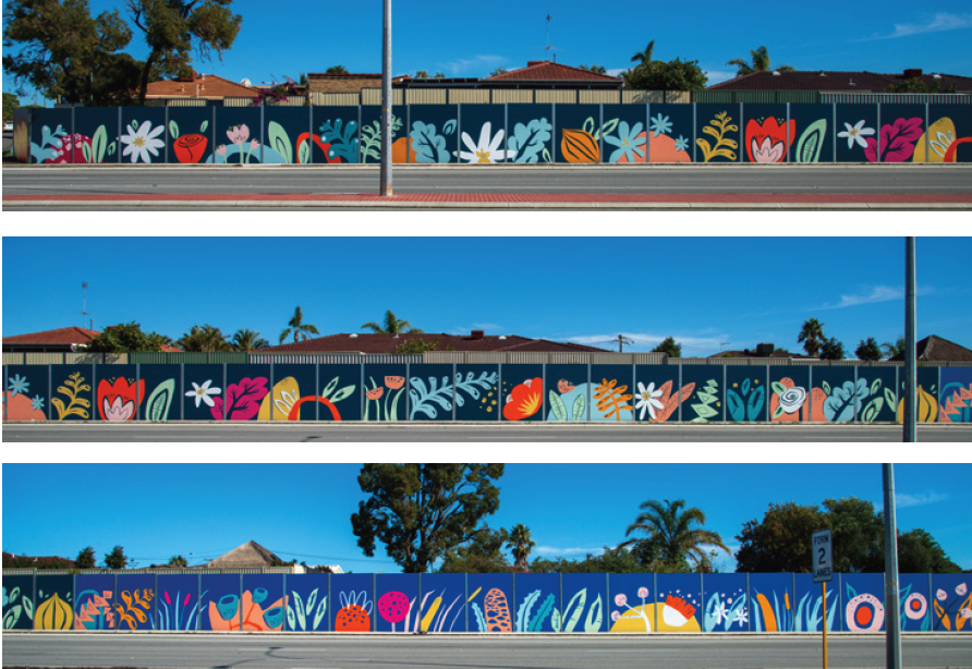
I was awarded a commission through an Expression of Interest (EOI) process to transform a 250-meter-long noise wall on Spearwood Avenue. The wall, which had originally been painted in a drab green colour, had long been an eyesore for the local residents. Positioned along a busy road where cars travel at speeds of up to 70 km/h, the wall had limited visibility to pedestrians, and the challenge was to create an engaging design that would be seen predominantly from passing vehicles.
The brief called for a simple, bright, and fun design that would uplift the area while also reflecting the unique characteristics of the suburb. To guide the design process, I held a community consultation workshop, where local residents shared their thoughts on what made Spearwood special. The feedback was invaluable, with many participants pointing out that the wall’s primary audience would be drivers rather than pedestrians, which meant that intricate details would not be visible. As a result, the design needed to focus on large, semi-abstract shapes that would be effective from a distance.
The mural itself is divided into three sections, each representing a different aspect of the suburb’s ecosystems. The leftmost section depicts the inland market gardens, which are a prominent feature of the area. This part of the mural features stylised representations of flowers and onions, reflecting the agricultural history of Spearwood. The middle section transitions into the wetlands, with abstract shapes representing plants such as banksia, bulrushes, gum trees, and tuart flowers. Finally, the mural moves into the coastal zone, showcasing flora such as pigface, Geraldton wax flowers, dune mosses, cushion bush, and seaweed—plants that are native to the region and reflect the suburb’s connection to the sea.
This thoughtful progression from inland market gardens to wetlands and then to the coast creates a visual narrative that mirrors the natural environment surrounding Spearwood. The design's bold and vibrant colours, combined with its large-scale semi-abstract shapes, ensure that the mural stands out from the passing traffic and provides a visual experience for drivers.
The project was completed over the course of nine days, with myself and a team of skilled assistants working to bring the design to life. The outcome is a mural that not only brightens the once-drab wall but also celebrates the local flora and fauna, giving the residents of Spearwood a meaningful and colourful representation of their community's unique ecosystems.
This project highlights the power of public art in transforming urban spaces and fostering a sense of pride and connection within the community. It was a rewarding experience to work closely with the residents and contribute to the aesthetic improvement of Spearwood Avenue.


Amazing New Mural for Santa Fe Restaurant!
“Paint the best wall mural you’ve ever painted…” This was my brief from Andrew and Sue at Santa Fe Restaurant in Subiaco, Perth. After 8 days of painting and pushing myself to the max, I managed to produce the best mural I had painted to date.

“Paint the best wall mural you’ve ever painted…” This was my brief from Andrew and Sue at Santa Fe Restaurant in Subiaco, Perth. After 8 days of painting and pushing myself to the max, I managed to produce the best mural I had painted to date.
Frida Kahlo was a Mexican artist who had a famously tragic life – from having Polio as a child, to being impaled by a tram in an accident when she was 18, which led to multiple spinal operations. She is one of my favourite artists and when Sue and Andrew asked me to paint the inside of iconic Santa Fe restaurant, I jumped at the chance to paint a tribute to Frida and her relationship with her on-and-off-again husband, Diego Rivera whom she affectionately called her “toad-frog”.
Apart from being a famous muralist, Diego was a well known womaniser and their relationship was famously tumultuous; a thrilling story of adultery, bisexuality and general disfunction. They divorced in 1939 and then remarried again the next year.
The structure of the mural is loosely based on one of my favourite paintings of hers, Las Dos Fridas (The Two Fridas) which shows two “Fridas” sitting side by side, with exposed hearts linked together with blood vessels. She painted it shortly after her divorce from Diego in 1939 and it records her emotions surrounding the crisis.
In Santa Fe, Frida is in the main room, with her beloved, ‘toad-frog’, Diego, in the next room. Though they aren’t looking directly at each other, they’re linked by their hearts which are each looking for the other. It’s both a tribute to their own relationship, but also more generally, a comment about the bonds of love and relationships.

Jazz Themed Mural for Four Points by Sheraton
Back in November 2015, Best Brew Bar at Four Points by Sheraton in Perth decided it was time to spice up its vibe. The once-plain walls were in desperate need of some personality, and the team behind the bar wanted to create a space that felt both fresh and professional.
Their idea was simple: combine cool portrait art with intricate patterns to give the bar a lively atmosphere. But there was one catch—the artwork needed to incorporate the bar’s corporate color scheme of grey, red, and green.
Enter artists Fieldey and Rob Jenkins, who totally nailed the brief. Fieldey brought a bold, jazz-inspired portrait to life on the back wall, adding a unique human touch to the bar. Meanwhile, Rob Jenkins worked his magic with stunning leaf patterns that swirled around the space, connecting beautifully with the mural and giving the bar an extra pop.

In November 2015, Best Brew Bar at Four Points by Sheraton Hotel in Perth reached out looking to breathe new life into its once-bare walls. Seeking to create an atmosphere that combined both artistic vibrancy and a professional touch, the venue invited myself and fellow Perth artist Rob Jenkins to create a striking Jazz themed mural.
The bar wanted to fuse my detailed, realistic portrait art with intricate patterning to cover much of the space. Furthermore, they wanted incorporate the venue’s corporate color palette—primarily grey with accents of red and green—into the piece to maintain a sense of continuity and belonging.
Rob and I rose to the occasion, delivering a stunning transformation that leaves a lasting impression. I took center stage with a striking, jazz-themed portrait adorning the rear wall, bringing a human element to the bar's design. Meanwhile, Rob’s signature leaf patterns flowed seamlessly around the bar, interacting with the mural and adding depth and movement to the space.
The final result was a beautiful, large scale mural that draws the eye and adds atmosphere and class to the space. This piece elevates the venue’s aesthetic appeal and ensures that it stands out as a vibrant cultural hub within Perth.

Coca-Cola Space Activation Murals
In November 2015, Coca-Cola tapped renowned Perth street artist Fieldey to bring a touch of retro flair to the legendary Ocean Beach Hotel (OBH) in Cottesloe, Western Australia. The project aimed to bring the vibrant spirit of the beach to life while subtly incorporating Coca-Cola branding.
Fieldey’s first masterpiece adorns the downstairs bar, where she transformed a wall into a stunning depiction of Cottesloe Beach. A custom-painted ‘Gidget’ surfboard was mounted on top, seamlessly tying in with the area’s surf culture. Coca-Cola branding was cleverly integrated, with two retro Coke bottles nestled in the sand and a logo etched onto the surfboard, maintaining a playful yet subtle nod to the brand.

In November 2015, Coca-Cola contacted me, to bring a touch of retro flair to the legendary Ocean Beach Hotel (OBH) in Cottesloe, Western Australia. The project aimed to bring the vibrant spirit of the beach to life while subtly incorporating Coca-Cola branding.
My first mural adorns the downstairs bar, where I transformed a wall into a stunning depiction of Cottesloe Beach. A custom-painted ‘Gidget’ surfboard was mounted on top, tying in with the area’s surf culture, and bringing the art off of the wall and into the space. Coca-Cola branding was subtly integrated, with two retro Coke bottles nestled in the sand and a logo etched onto the surfboard, maintaining a playful yet subtle nod to the brand.
Upstairs at the rooftop bar, I took a different approach with a tiki-inspired mural. The faux wood-paneled design captures the essence of retro beachside bars, complete with a pin-up model sipping a Coke and a glowing neon Coke sign. This vibrant artwork has quickly become a fan favorite, with countless Instagram photos circulating featuring the stunning mural.
The murals have transformed the OBH into a visual spectacle but and become a key part of the bar’s atmosphere. To document the creative process, I produced two custom videos that give a behind-the-scenes look at the project.
These murals are a perfect blend of art, culture, and branding, leaving an unforgettable mark on the iconic Ocean Beach Hotel and further solidifying the relationship between Coca-Cola and artistic expression.