
250m-Long Mural for Spearwood Ave, Yangebup
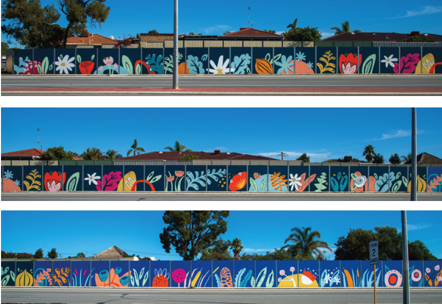
I was awarded a commission through an Expression of Interest (EOI) process to transform a 250-meter-long noise wall on Spearwood Avenue. The wall, which had originally been painted in a drab green colour, had long been an eyesore for the local residents. Positioned along a busy road where cars travel at speeds of up to 70 km/h, the wall had limited visibility to pedestrians, and the challenge was to create an engaging design that would be seen predominantly from passing vehicles.
The brief called for a simple, bright, and fun design that would uplift the area while also reflecting the unique characteristics of the suburb. To guide the design process, I held a community consultation workshop, where local residents shared their thoughts on what made Spearwood special. The feedback was invaluable, with many participants pointing out that the wall’s primary audience would be drivers rather than pedestrians, which meant that intricate details would not be visible. As a result, the design needed to focus on large, semi-abstract shapes that would be effective from a distance.
The mural itself is divided into three sections, each representing a different aspect of the suburb’s ecosystems. The leftmost section depicts the inland market gardens, which are a prominent feature of the area. This part of the mural features stylised representations of flowers and onions, reflecting the agricultural history of Spearwood. The middle section transitions into the wetlands, with abstract shapes representing plants such as banksia, bulrushes, gum trees, and tuart flowers. Finally, the mural moves into the coastal zone, showcasing flora such as pigface, Geraldton wax flowers, dune mosses, cushion bush, and seaweed—plants that are native to the region and reflect the suburb’s connection to the sea.
This thoughtful progression from inland market gardens to wetlands and then to the coast creates a visual narrative that mirrors the natural environment surrounding Spearwood. The design's bold and vibrant colours, combined with its large-scale semi-abstract shapes, ensure that the mural stands out from the passing traffic and provides a visual experience for drivers.
The project was completed over the course of nine days, with myself and a team of skilled assistants working to bring the design to life. The outcome is a mural that not only brightens the once-drab wall but also celebrates the local flora and fauna, giving the residents of Spearwood a meaningful and colourful representation of their community's unique ecosystems.
This project highlights the power of public art in transforming urban spaces and fostering a sense of pride and connection within the community. It was a rewarding experience to work closely with the residents and contribute to the aesthetic improvement of Spearwood Avenue.


Mural for South Coast Baptist College
I was commissioned by South Coast Baptist College to create a student-assisted mural that would serve as both a visual representation of the school’s identity and a celebration of its sporting culture. The brief required the incorporation of the school’s colours, the animals representing the four sports houses, and a verse that aligned with the school’s values.
To initiate the project, I conducted a concept-building workshop with Year 10 art students. This session allowed the students to actively engage in the creative process, sharing their ideas and perspectives on what the mural should represent. Their input was instrumental in shaping the direction of the design, ensuring that the final artwork would be a true reflection of the school community.
The design I developed incorporated the school colours and featured the four sporting house animals, each carefully integrated into the composition to reflect the unique characteristics of the houses and their respective students. The use of bold, vibrant colours helped to create a dynamic and engaging visual, while the animals were positioned in a way that symbolised both the individuality of each house and their collective unity.
The chosen verse was seamlessly woven into the design, reinforcing the values of the school and adding a layer of meaning to the artwork. This thoughtful inclusion ensured that the mural was not only visually striking but also resonated with the students and staff on a deeper level.
A key aspect of this project was the active involvement of the students in the mural’s execution. Throughout the painting process, the Year 10 students had the opportunity to contribute directly to the artwork, allowing them to take ownership of the mural and deepen their connection to the finished piece. This collaboration resulted in a mural that is not only a testament to the school’s spirit but also a reflection of the students’ creativity and commitment.
The completed mural now stands as a vibrant and meaningful addition to South Coast Baptist College, embodying the school’s values, celebrating its sporting achievements, and showcasing the collaborative effort that went into its creation. It was a privilege to work alongside the students and staff, and the mural will undoubtedly continue to inspire pride and community for years to come.


Sam Kerr Mural for Optus Sport
I was given the opportunity to paint a 7-metre-high mural of Matildas superstar Sam Kerr for the Optus Sport documentary Football Belongs. This project was an incredible experience—not only in its scale but also in its message. The mural was completed in just three days, with every step of the process filmed and documented for the feature.
From the outset, my goal was to portray Sam Kerr as more than just an athlete; I wanted to celebrate her strength, power, and determination. Women in street art are so often depicted as passive or ornamental, but with this mural, I aimed to challenge that narrative. I wanted young women and girls to see Sam as an inspiration—someone who has carved out a career at the highest level of football through skill and perseverance.
“So much of street art is pretty girls or pretty girls crying. I wanted to create something that was a bit of an antidote to that,” I explained during the filming of the documentary. Instead of focusing on beauty, this piece captures athleticism and ambition—qualities that define Sam Kerr and set her apart as a role model.
The mural now stands in Fremantle, a striking tribute to one of Australia’s most celebrated athletes. Seeing the response from the community has been incredibly rewarding. Public art has the power to elevate voices, tell stories, and redefine perceptions, and I am honoured to have contributed to this project in a way that highlights the significance of women in sport.
This experience reinforced my belief in the role of street art in shaping conversations and inspiring change. Whether through community projects like the Weeip Park Mural or high-profile commissions like this one, my goal remains the same: to create art that resonates, empowers, and leaves a lasting impact.


Collaborative Student-Led Murals at Safety Bay Senior High
I was invited to facilitate two student-assisted murals in collaboration with Safety Bay Senior High School. The aim was to beautify the school and engage students in a creative process. The first mural, created for the school’s 40th Anniversary, and the second, promoting ‘The Arts,’ were painted with the help of selected Year 8 to 10 students and art teacher Tracey Sharpe.
The process started with a brainstorming workshop where I guided the students in developing ideas for the mural. Using their input, I created a professional concept that was approved by the school. A second workshop focused on skills development, where I taught painting techniques to help the students gain confidence before the final full-day painting session. The students brought the walls to life, and Tracey and I finished the murals to a professional standard the following day.
Every project I take on is an opportunity to push creative boundaries and bring a little more art into the world. Whether it's a community focused mural or a large scale corporate piece, my goal is always to create something that tells a story and makes an impact.


Pop-up Beatles Mural for Kaleidoscope Festival
I recently created a stunning pop-up mural paying tribute to The Beatles, as part of Joondalup’s Kaleidoscope Festival.
Taking inspiration from The Beatles' timeless legacy, I infused the piece with meticulous detail and lifelike representation, capturing the essence of each band member. The artwork served as both a nostalgic homage and a modern interpretation, seamlessly blending street art aesthetics with classic rock iconography.
I wanted to create something that captures the spirit of The Beatles and the energy of the Kaleidoscope Festival—bold, immersive, and full of life.
The pop-up nature of the mural made it a unique attraction, reinforcing the festival’s ethos of ephemeral, ever-changing artistic expression. As the festival wrapped up, the mural disappeared, leaving behind only memories and photographs—a fitting tribute to both the fleeting magic of live art and the timeless legacy of The Beatles.
The Kaleidoscope Festival once again proved itself as a premier event for immersive art experiences, and I was honored that my Beatles mural stood out as a festival highlight.


Custom Window Graphics for Coca-Cola
I had the privilege of again working with Coca-Cola, this time on a unique digital window artwork for Polly Coffee Bar, an iconic venue in the heart of Perth’s main cultural precinct. This was an exciting challenge—creating a design that reflected the cafe owner’s vision while subtly incorporating Coca-Cola branding.
Since the final piece was to be printed onto vinyl and applied to the cafe’s windows, I proposed a photographic-based montage. Inspired by the Colombian coffee region, the artwork was shaped by the owner's desire to emphasise coffee, jungles, and the hardworking growers of Latin America.
To make this vision a reality, I teamed up with professional photographer Matt Fieldes and traveled to Colombia’s Zona Cafetera. There, I personally directed the photography process, capturing the lush landscapes and vibrant coffee culture firsthand.
Using these stunning images, I created a rich jungle and coffee montage—bold, immersive, and alive with color. The Coca-Cola branding was woven in subtly, enhancing rather than overpowering the beauty of the scene. The final window is visually striking tribute to coffee culture that perfectly complements Polly Coffee Bar’s atmosphere.
This project was an incredible journey from concept to completion, and I’m thrilled to see it become part of Perth’s creative landscape.

“We tasked Fieldey with a rather tricky brief. To pay homage to a unique venue, Pollys Coffee Bar, in one of the most iconic part in Perth.
Not only did Fieldey decipher our complex brief, she kept numerous stakeholders happy and engaged while providing a fantastic end solution that complimented the outlet and surrounds.
Fieldey was a delight to work with and I look forward to collaborating with her on many projects to come.”
Kristy Aylmore, Customer Activation Manager, Coca-Cola.

Cult Movie Themed Murals for Winebox Hotel
Another standout project was at Winebox, Chile’s first hotel and winery made entirely from shipping containers. I was invited to create three custom murals in different rooms, blending a wine theme with cult movie references.
Working with my partner Mitch Low, we designed three bespoke murals inspired by Pulp Fiction, Barbarella, and Foxy Brown, each incorporating cheeky wine references. The murals are a blend of black and white realism, with two bright accent colors, carefully matched to each room’s dominant color scheme. Bright retro pop patterns tied everything together, reinforcing the vintage aesthetic while making the murals a seamless part of the interior design.
This visually striking collection of murals enhance the guest experience and serve as a fantastic social media magnet. Visitors frequently share photos of the artwork, turning them into an ongoing promotional tool for the hotel.


Huge (30M) Mural for Stockland Bull Creek Shopping Centre
I recently had the opportunity to be the chief facilitator and muralist for a project that brought together creativity, community, and local culture. Stockland Bull Creek Shopping Centre commissioned me to create a mural on a massive 30-meter exterior wall, and what made it even more exciting was the involvement of a talented group of Year 11 students from Melville Senior High.
The mural needed to reflect the natural surroundings of the area while using bright colors and an eye-catching narrative. After brainstorming with the students, two inspiring art teachers—Ali Blackwell and Jenna Antoniolli—joined the team, and together we developed a design that reflected the local environment in a meaningful way.
I recently had the opportunity to be the chief facilitator and muralist for a project that brought together creativity, community, and local culture. Stockland Bull Creek Shopping Centre commissioned me to create a mural on a massive 30-meter exterior wall, with the involvement of a talented group of Year 11 students from Melville Senior High.
The mural needed to reflect the natural surroundings of the area while using bright colors and an eye-catching narrative. After brainstorming with the students, two inspiring art teachers—Ali Blackwell and Jenna Antoniolli—joined the team, and together we developed a design that reflected the local environment in a meaningful way.
The theme explored the Nyoongar seasonal calendar, bringing the area’s connection to nature front and centre. The mural features local bird species like the crow, galah, and ibis, painted in vibrant detail. My role was to bring these birds to life, working alongside the students who contributed their skills in patterning and design.
The whole process was a blast. We kicked off with an ideas-building workshop at the school, where I shared techniques and creative concepts with the Year 11 students. Then, over three days, we worked together to transform the blank wall into a work of art. Watching the students take ownership of the project while learning along the way was incredibly rewarding.
This project really showcased how shopping centres like Stockland Bull Creek can not only enrich their environment and connect with the local community through collaborative art.


Amazing New Mural for Santa Fe Restaurant!
“Paint the best wall mural you’ve ever painted…” This was my brief from Andrew and Sue at Santa Fe Restaurant in Subiaco, Perth. After 8 days of painting and pushing myself to the max, I managed to produce the best mural I had painted to date.

“Paint the best wall mural you’ve ever painted…” This was my brief from Andrew and Sue at Santa Fe Restaurant in Subiaco, Perth. After 8 days of painting and pushing myself to the max, I managed to produce the best mural I had painted to date.
Frida Kahlo was a Mexican artist who had a famously tragic life – from having Polio as a child, to being impaled by a tram in an accident when she was 18, which led to multiple spinal operations. She is one of my favourite artists and when Sue and Andrew asked me to paint the inside of iconic Santa Fe restaurant, I jumped at the chance to paint a tribute to Frida and her relationship with her on-and-off-again husband, Diego Rivera whom she affectionately called her “toad-frog”.
Apart from being a famous muralist, Diego was a well known womaniser and their relationship was famously tumultuous; a thrilling story of adultery, bisexuality and general disfunction. They divorced in 1939 and then remarried again the next year.
The structure of the mural is loosely based on one of my favourite paintings of hers, Las Dos Fridas (The Two Fridas) which shows two “Fridas” sitting side by side, with exposed hearts linked together with blood vessels. She painted it shortly after her divorce from Diego in 1939 and it records her emotions surrounding the crisis.
In Santa Fe, Frida is in the main room, with her beloved, ‘toad-frog’, Diego, in the next room. Though they aren’t looking directly at each other, they’re linked by their hearts which are each looking for the other. It’s both a tribute to their own relationship, but also more generally, a comment about the bonds of love and relationships.

Jazz Themed Mural for Four Points by Sheraton
Back in November 2015, Best Brew Bar at Four Points by Sheraton in Perth decided it was time to spice up its vibe. The once-plain walls were in desperate need of some personality, and the team behind the bar wanted to create a space that felt both fresh and professional.
Their idea was simple: combine cool portrait art with intricate patterns to give the bar a lively atmosphere. But there was one catch—the artwork needed to incorporate the bar’s corporate color scheme of grey, red, and green.
Enter artists Fieldey and Rob Jenkins, who totally nailed the brief. Fieldey brought a bold, jazz-inspired portrait to life on the back wall, adding a unique human touch to the bar. Meanwhile, Rob Jenkins worked his magic with stunning leaf patterns that swirled around the space, connecting beautifully with the mural and giving the bar an extra pop.

In November 2015, Best Brew Bar at Four Points by Sheraton Hotel in Perth reached out looking to breathe new life into its once-bare walls. Seeking to create an atmosphere that combined both artistic vibrancy and a professional touch, the venue invited myself and fellow Perth artist Rob Jenkins to create a striking Jazz themed mural.
The bar wanted to fuse my detailed, realistic portrait art with intricate patterning to cover much of the space. Furthermore, they wanted incorporate the venue’s corporate color palette—primarily grey with accents of red and green—into the piece to maintain a sense of continuity and belonging.
Rob and I rose to the occasion, delivering a stunning transformation that leaves a lasting impression. I took center stage with a striking, jazz-themed portrait adorning the rear wall, bringing a human element to the bar's design. Meanwhile, Rob’s signature leaf patterns flowed seamlessly around the bar, interacting with the mural and adding depth and movement to the space.
The final result was a beautiful, large scale mural that draws the eye and adds atmosphere and class to the space. This piece elevates the venue’s aesthetic appeal and ensures that it stands out as a vibrant cultural hub within Perth.